
About
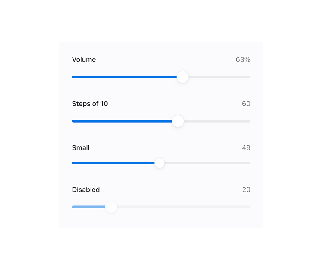
A labeled range slider for picking a numeric value, with an optional live value readout and custom formatting, built on a native range input for full keyboard and touch support.
Built with React and Tailwind. Copy the prompt and paste it into Claude Code, Cursor or Lovable: your agent adds Range Slider to your project and fits it to your theme.
Code
How Range Slider is used: the demo's code. The component's own source comes with a free account.
Usage.tsx
"use client";

import Slider from "@/components/ui/slider";
import { useState } from "react";

export default function SliderDemo() {
  const [volume, setVolume] = useState(35);

  return (
    <div className="mors-scope flex w-full max-w-sm flex-col gap-6 p-6">
      <Slider
        label="Volume"
        value={volume}
        onValueChange={setVolume}
        formatValue={(value) => `${value}%`}
      />
      <Slider label="Steps of 10" defaultValue={40} step={10} showValue />
      <Slider label="Small" size="sm" defaultValue={70} showValue />
      <Slider label="Disabled" defaultValue={20} disabled showValue />
    </div>
  );
}
More by murad-sinatra
View all
Event Calendar
50
Table
7
Drawer
5
Combobox
3
Toggles
3
Command Palette
2
Mors Card
2
Token Field
2
More in Forms
View all

Login 1
63

Premium Auth
570

Contact Card
1.1K

Form
18

Book A Demo 1
91
Authentication Card
52

Card Studio
47

Login Card
35
