
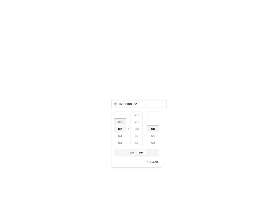
About
Hour, minute and optional second scroll columns with 12/24h modes, step intervals and keyboard nav.
Built with React and Tailwind. Copy the prompt and paste it into Claude Code, Cursor or Lovable: your agent adds Time Picker to your project and fits it to your theme.
Code
How Time Picker is used: the demo's code. The component's own source comes with a free account.
Usage.tsx
import {
  TimePicker,
  TimePickerTrigger,
  TimePickerContent,
} from "@/components/ui/time-picker";

export default function TimePickerDemo() {
  return (
    <div className="flex min-h-[420px] w-full items-center justify-center bg-background p-8">
      <div className="w-64">
        <TimePicker format="12h" showSeconds clearable>
          <TimePickerTrigger />
          <TimePickerContent />
        </TimePicker>
      </div>
    </div>
  );
}
Dependencies
More by Mohammad Shehadeh
View all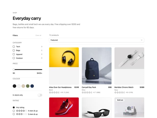
Ecommerce Category Page
99
Feature Problem Cards
99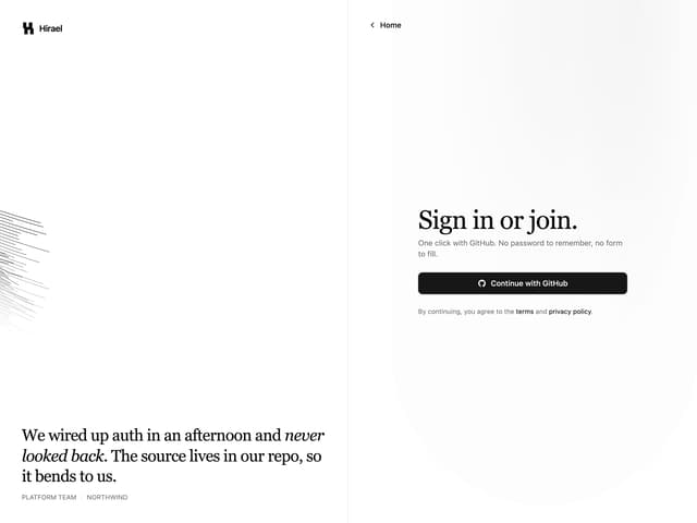
Split Login
93
Feature Grid Spotlight Cards
90
Comparison Section
81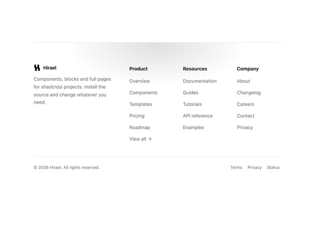
Rounded Top Footer
79
Comparison Table
77
FAQ Two Column
76
More in Forms
View all

Login 1
63

Premium Auth
570

Contact Card
1.1K

Form
18

Book A Demo 1
91
Authentication Card
52

Card Studio
47

Login Card
35
