
About
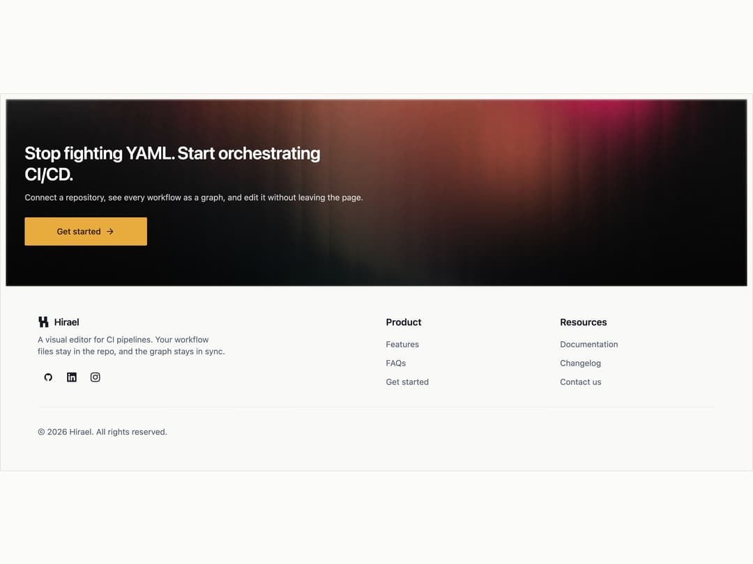
Two-part footer: a bordered CTA panel over a rotated, blurred image with a headline, sub-copy and a wide sign-up button, above a brand block with social icons, two link columns and a hairline copyright row.
Built with React and Tailwind. Copy the prompt and paste it into Claude Code, Cursor or Lovable: your agent adds CTA Footer to your project and fits it to your theme.
Code
How CTA Footer is used: the demo's code. The component's own source comes with a free account.
Usage.tsx
import Footer06 from "@/components/ui/footer-06";

export default function FooterDemo() {
  return (
    <div className="w-full">
      <Footer06 />
    </div>
  );
}
Dependencies
More by Mohammad Shehadeh
View all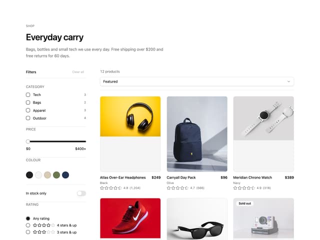
Ecommerce Category Page
99
Feature Problem Cards
99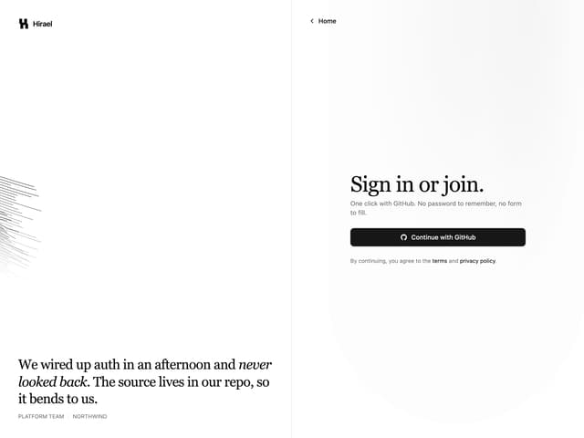
Split Login
93
Feature Grid Spotlight Cards
90
Comparison Section
81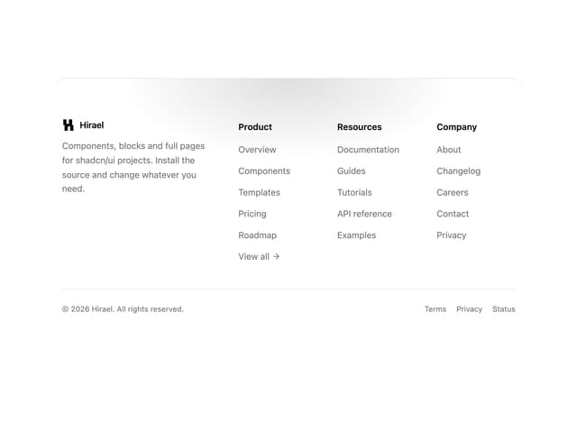
Rounded Top Footer
79
Comparison Table
77
FAQ Two Column
76
More in Navigation
View all

Liquid Glass Expandable Sidebar
60

Footer with Big Wordmark
37

Sidebar
391

Oversized 404 Numeral
78
Navbar with Theme Toggle
66

Pagination
108

NavBar
2
Tabs like bookmark
81
