

About
A button with a clip-path fill sweep animation that reveals an inverted color copy on hover or focus, with configurable direction, duration and ease.
Built with React and Tailwind. Copy the prompt and paste it into Claude Code, Cursor or Lovable: your agent adds Fill Button to your project and fits it to your theme.
Code
How Fill Button is used: the demo's code. The component's own source comes with a free account.
Usage.tsx
import { FillButton } from "@/components/ui/fill-button";

export default function FillButtonDemo() {
  return (
    <div className="flex items-center justify-center w-full h-full min-h-[300px]">
      <FillButton direction="up" duration={0.45} ease="power3.out">
        Hover me
      </FillButton>
    </div>
  );
}
Dependencies
More by mirukullacode
View all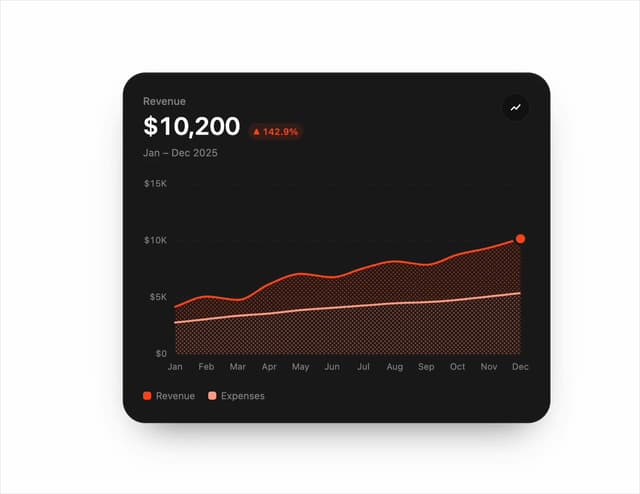
Chart Line
141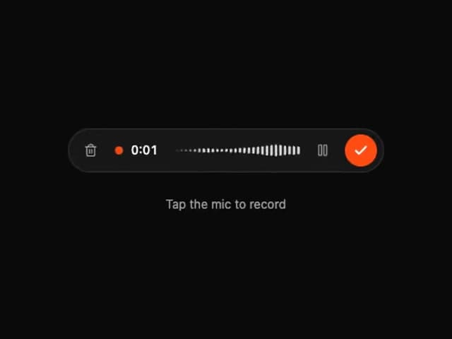
Tweenly AI Recorder
88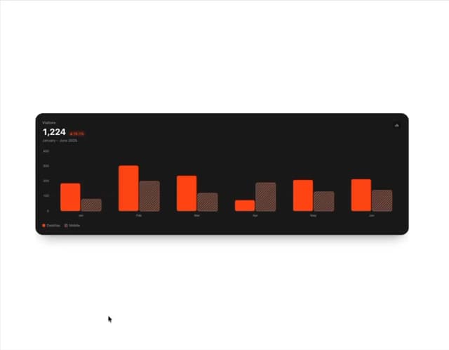
Animated Bar Chart
62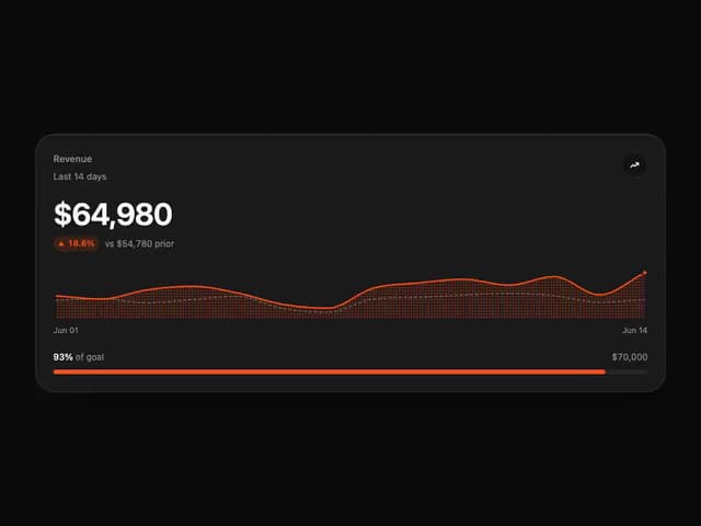
Tweenly Chart KPI
58
Tweenly Hero Background
44
Tweenly Chart Radial
34
Tweenly Image Arc
28
Tweenly Curved Carousel
28
More in Buttons
View all
Texture Button
108
Button
14

Notification Button
117

HeroUI Button Group
2

Eclipse Button
44
Button Save
50

App Store Button
484

Base Button
1


