

About
A styled wrapper around the native HTML select element for choosing one option from a dropdown, with support for option groups, disabled and invalid states.
Built with React and Tailwind. Copy the prompt and paste it into Claude Code, Cursor or Lovable: your agent adds Native Select to your project and fits it to your theme.
Code
How Native Select is used: the demo's code. The component's own source comes with a free account.
Usage.tsx
import {
  NativeSelect,
  NativeSelectOption,
} from "@/components/ui/native-select";

export default function NativeSelectDisabled() {
  return (
    <div dir="rtl">
      <NativeSelect disabled>
        <NativeSelectOption value="">غیرفعال</NativeSelectOption>
        <NativeSelectOption value="apple">سیب</NativeSelectOption>
        <NativeSelectOption value="banana">موز</NativeSelectOption>
        <NativeSelectOption value="blueberry">بلوبری</NativeSelectOption>
      </NativeSelect>
    </div>
  );
}
Dependencies
More by miladjoodi
View all
Image Diff Slider
32
Empty State
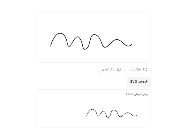
Signature Pad
Hover Card

File Upload

Card

Drag Scroll
Context Menu
More in Forms
View all

Login 1
64

Premium Auth
571

Contact Card
1.1K

Form
18

Book A Demo 1
91
Authentication Card
52

Card Studio
47

Login Card
35
