
About
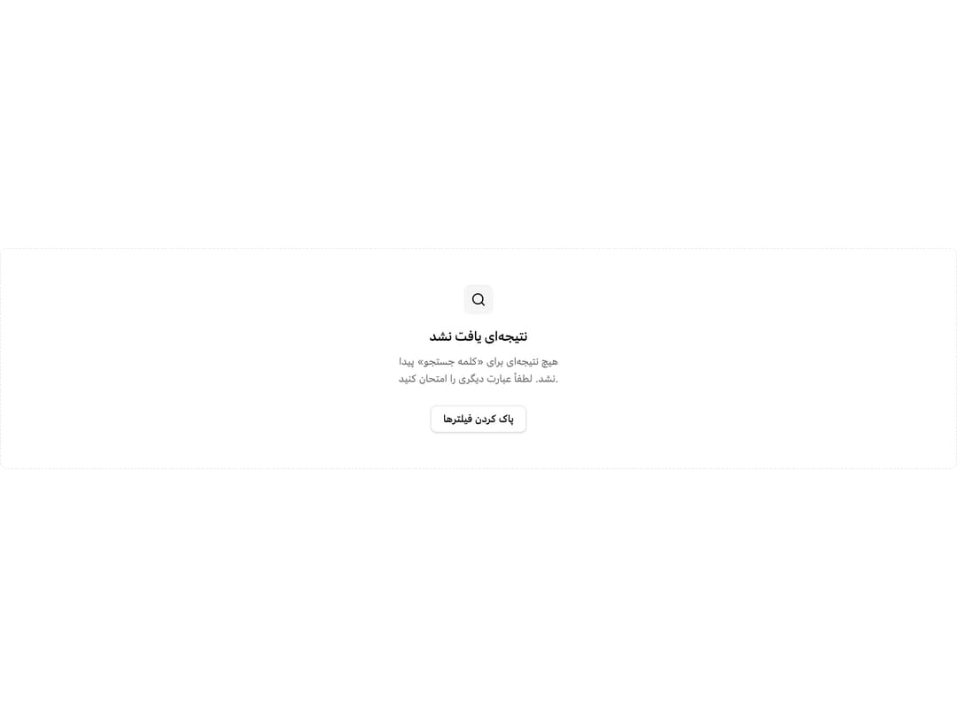
A placeholder layout for showing when there is no data to display, with an icon, title, description and optional action buttons.
Built with React and Tailwind. Copy the prompt and paste it into Claude Code, Cursor or Lovable: your agent adds Empty State to your project and fits it to your theme.
Code
How Empty State is used: the demo's code. The component's own source comes with a free account.
Usage.tsx
import { Button } from "@/components/ui/button";
import {
Empty,
EmptyContent,
EmptyDescription,
EmptyHeader,
EmptyMedia,
EmptyTitle,
} from "@/components/ui/empty";
import { Search } from "lucide-react";
export default function EmptySearchResultsDemo() {
return (
<Empty className="border">
<EmptyHeader>
<EmptyMedia variant="icon">
<Search className="size-5" />
</EmptyMedia>
<EmptyTitle>نتیجهای یافت نشد</EmptyTitle>
<EmptyDescription>
هیچ نتیجهای برای «کلمه جستجو» پیدا نشد. لطفاً عبارت دیگری را امتحان
کنید.
</EmptyDescription>
</EmptyHeader>
<EmptyContent>
<Button variant="outline">پاک کردن فیلترها</Button>
</EmptyContent>
</Empty>
);
}
Dependencies
More by miladjoodi
View all
Image Diff Slider
32
Signature Pad
Hover Card

File Upload
Card
Drag Scroll
Native Select
Context Menu