
About
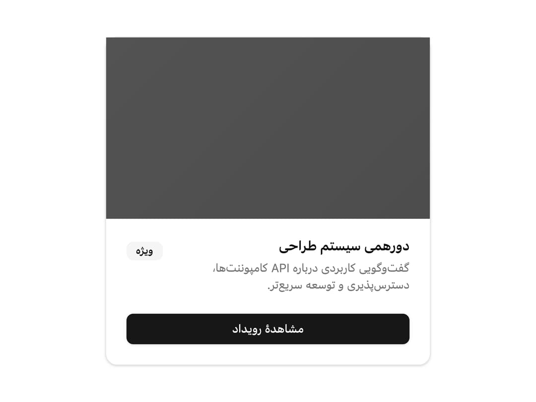
A content container with header, title, description, action, body and footer sections, built RTL-first for Farsi interfaces (e.g. a login form or an event card).
Built with React and Tailwind. Copy the prompt and paste it into Claude Code, Cursor or Lovable: your agent adds Card to your project and fits it to your theme.
Code
How Card is used: the demo's code. The component's own source comes with a free account.
Usage.tsx
import { Badge } from "@/components/ui/badge";
import { Button } from "@/components/ui/button";
import {
Card,
CardAction,
CardDescription,
CardFooter,
CardHeader,
CardTitle,
} from "@/components/ui/card";
export default function CardImage() {
return (
<Card className="relative mx-auto w-full max-w-sm pt-0" dir="rtl">
<div className="absolute inset-0 z-30 aspect-video bg-black/35" />
<img
src="https://cdn.21st.dev/assets/mirror/82/82a889804014e7d2669ca3ccb9a0d44985c08dfacafb719195d97de423d25cc3.png"
alt="تصویر رویداد"
className="relative z-20 aspect-video w-full object-cover brightness-60 grayscale dark:brightness-40"
/>
<CardHeader>
<CardAction>
<Badge variant="secondary">ویژه</Badge>
</CardAction>
<CardTitle>دورهمی سیستم طراحی</CardTitle>
<CardDescription>
گفتوگویی کاربردی درباره API کامپوننتها، دسترسپذیری و توسعه سریعتر.
</CardDescription>
</CardHeader>
<CardFooter>
<Button className="w-full">مشاهدهٔ رویداد</Button>
</CardFooter>
</Card>
);
}
More by miladjoodi
View all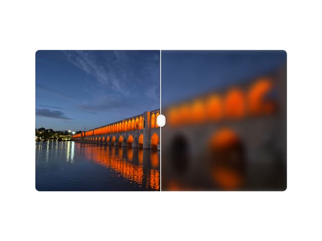
Image Diff Slider
32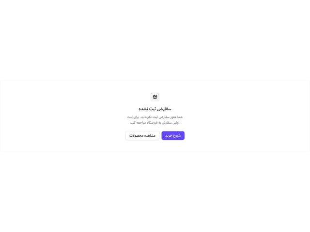
Empty State
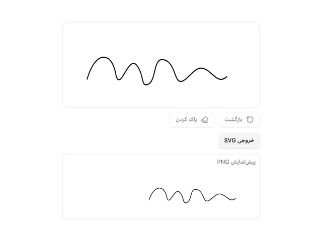
Signature Pad
Hover Card

File Upload
Drag Scroll
Native Select
Context Menu
More in Cards
View all

Course Design Cards
1.3K

Statistics Card 7
327
Statistics Card 2
305

Interactive Tech Stack Bento Grid with Hover Effects
625

Card Studio
5
The Item one
4

Weather Card
65

Card
9