
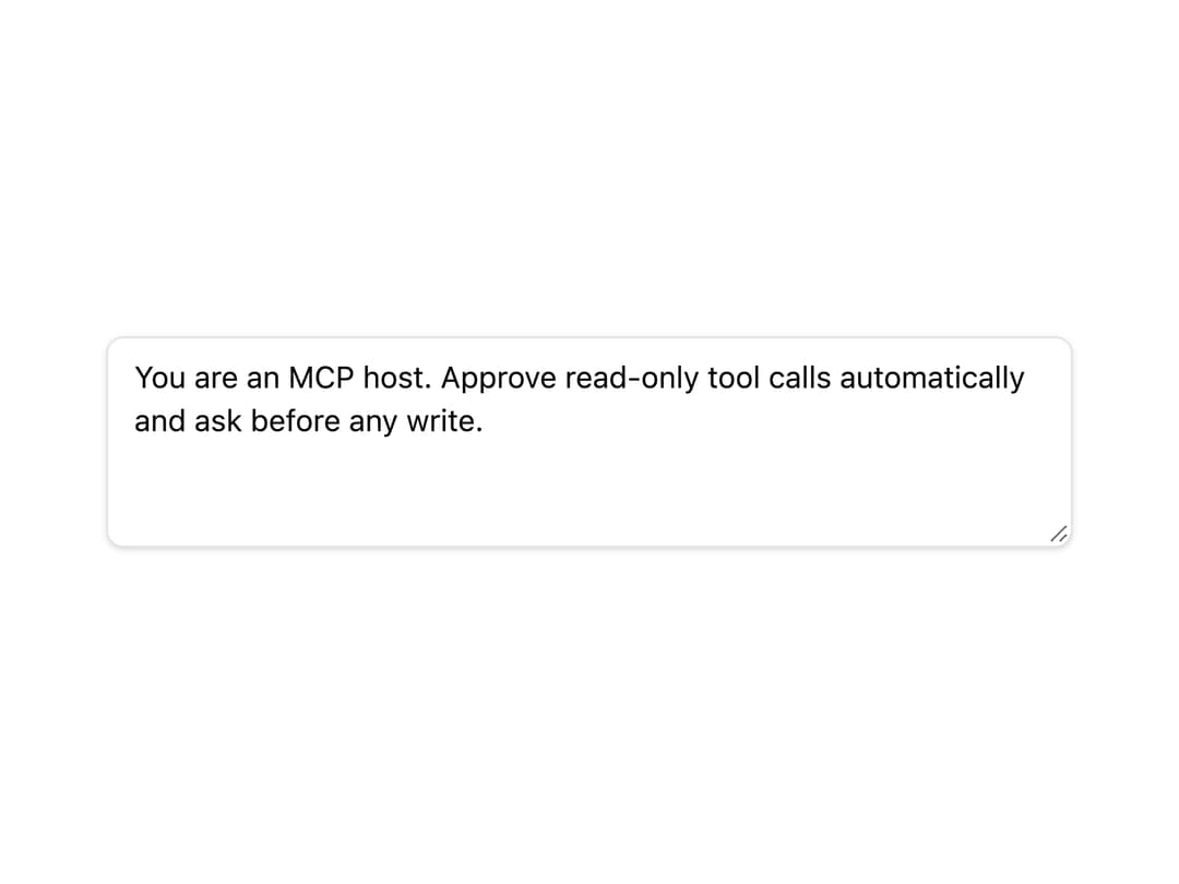
About
A styled multi-line text input field for forms, chat prompts, and system messages, with focus, disabled, and placeholder states.
Built with React and Tailwind. Copy the prompt and paste it into Claude Code, Cursor or Lovable: your agent adds Textarea to your project and fits it to your theme.
Code
How Textarea is used: the demo's code. The component's own source comes with a free account.
Usage.tsx
import { Textarea } from "@/components/ui/textarea";
import { useState } from "react";

export default function Example() {
  const [value, setValue] = useState("");
  return (
    <div className="w-full max-w-md">
      <Textarea
        placeholder="Describe the tool you want to call…"
        rows={4}
        value={value}
        onChange={(e) => setValue(e.target.value)}
      />
    </div>
  );
}
More by mayurrawte
View all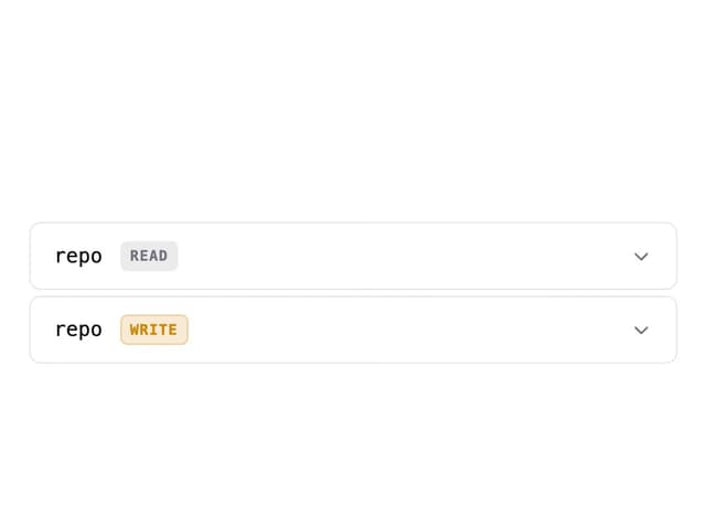
MCP Scope Inspector
2
Feedback Buttons
2
Tooltip
2
Skeleton
2
Accordion
1
MCP Resource Browser
MCP App Frame
Counter
More in Forms
View all

Login 1
64

Premium Auth
571

Contact Card
1.1K

Form
18

Book A Demo 1
91
Authentication Card
52

Card Studio
47

Login Card
35
