
About
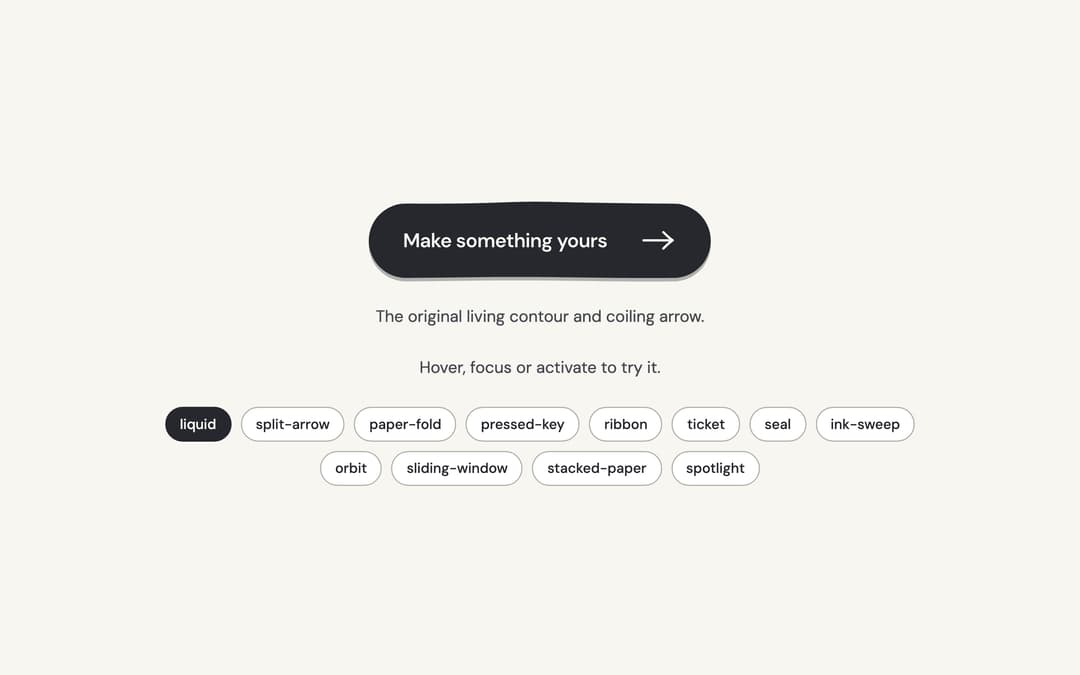
Twelve tactile calls to action: living ink, paper, keys, tickets and small moments of motion around one native button.
Built with React and Tailwind. Copy the prompt and paste it into Claude Code, Cursor or Lovable: your agent adds Hero Button to your project and fits it to your theme.
Code
How Hero Button is used: the demo's code. The component's own source comes with a free account.
Usage.tsx
"use client";

import * as React from "react";
import { HeroButton, heroButtonAppearances, type HeroButtonAppearance } from "@/components/ui/hero-button";

const concepts: Record<HeroButtonAppearance, { label: string; cue: string }> = {
  liquid: { label: "Make something yours", cue: "The original living contour and coiling arrow." },
  "split-arrow": { label: "Start something", cue: "The arrow has its own sliding tab." },
  "paper-fold": { label: "Open a new chapter", cue: "A folded corner lifts from the paper." },
  "pressed-key": { label: "Make it happen", cue: "A raised key settles under your pointer." },
  ribbon: { label: "Follow your curiosity", cue: "A directional ribbon pulls its trailing stripes." },
  ticket: { label: "Keep my place", cue: "A perforated admission ticket with a moving stub." },
  seal: { label: "Made for you", cue: "An organic seal turns its inner rim." },
  "ink-sweep": { label: "Leave your mark", cue: "A stroke of ink grows behind the words." },
  orbit: { label: "Explore an idea", cue: "A small satellite follows the arrow's orbit." },
  "sliding-window": { label: "A fresh perspective", cue: "The words roll through a clipped window." },
  "stacked-paper": { label: "Start a collection", cue: "Two offset sheets fan beneath the top page." },
  spotlight: { label: "Find your focus", cue: "A quiet pool of light follows the pointer." },
};

/** The demo brings its own 000h canvas, so it looks right on any host page (the component package sets nothing global). */
function DemoSurface({ children }: { children: import("react").ReactNode }) {
  return <div className="grid min-h-screen w-full place-items-center bg-[var(--v-canvas)] p-4 font-[family-name:var(--font-text)] text-[length:var(--fs-body)] leading-[var(--lh-body)] text-[var(--v-text)]">{children}</div>;
}

export default function Demo() {
  const [appearance, setAppearance] = React.useState<HeroButtonAppearance>("liquid");
  const [count, setCount] = React.useState(0);
  const concept = concepts[appearance];
  return (
    <DemoSurface>
      <div className="mx-auto flex min-h-[420px] w-full max-w-3xl flex-col items-center justify-center gap-6 p-8 text-center">
        <HeroButton key={appearance} appearance={appearance} onClick={() => setCount((value) => value + 1)}>
          {concept.label}
        </HeroButton>
        <p className="text-sm text-[var(--v-text-2)]">{concept.cue}</p>
        <p role="status" aria-live="polite" className="text-sm text-[var(--v-text-2)]">
          {count ? `${count} ${count === 1 ? "local action" : "local actions"}.` : "Hover, focus or activate to try it."}
        </p>
        <div role="group" aria-label="Appearance" className="flex flex-wrap justify-center gap-2">
          {heroButtonAppearances.map((option) => (
            <button
              key={option}
              type="button"
              aria-pressed={appearance === option}
              onClick={() => setAppearance(option)}
              className="rounded-full border border-[var(--v-border)] bg-[var(--v-paper)] px-3 py-1.5 text-xs font-medium text-[var(--v-text)] transition-colors hover:bg-[var(--v-beige)] aria-pressed:border-[var(--v-ink)] aria-pressed:bg-[var(--v-ink)] aria-pressed:text-[var(--v-on-ink)]"
            >
              {option}
            </button>
          ))}
        </div>
      </div>
    </DemoSurface>
  );
}
Dependencies
More by Sanjay Kumar
View all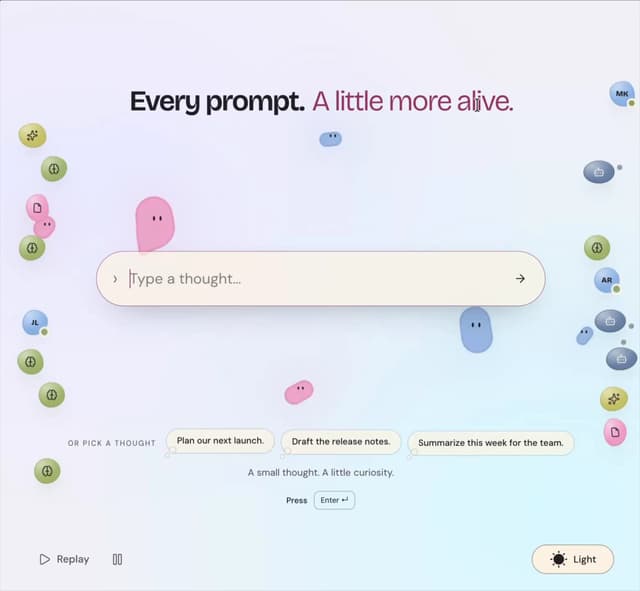
Prompt Bond
163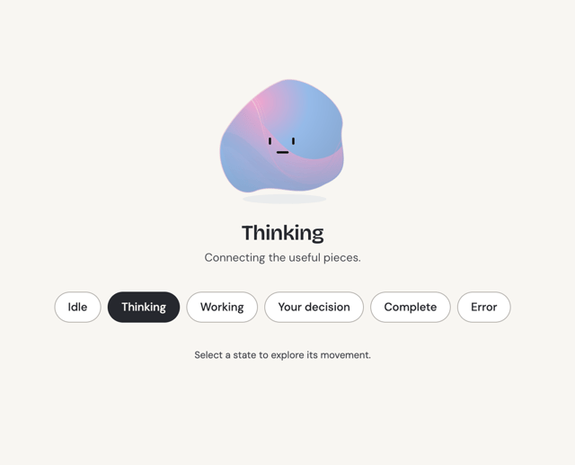
Agent State
93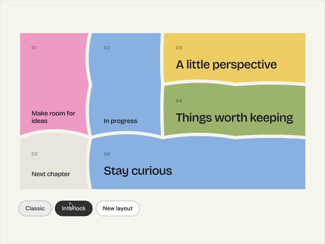
Bento Grid
59
Theme Toggle
42
Variable Proximity
27
Dock
23
Slider
18
Animated Icon
18
More in Buttons
View all
Texture Button
108
Button
14

Notification Button
117

HeroUI Button Group
2

Eclipse Button
44
Button Save
50

App Store Button
484

Base Button
1


