
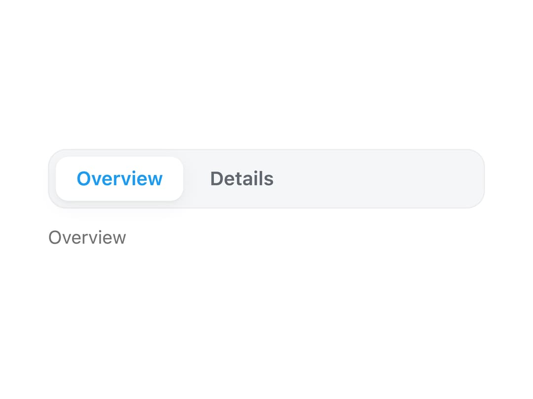
About
A single-select radio-group control that renders a set of mutually exclusive options (or navigation links) as a compact pill, with keyboard arrow-key movement and vertical, horizontal, and icon-label layouts.
Built with React and Tailwind. Copy the prompt and paste it into Claude Code, Cursor or Lovable: your agent adds Segmented to your project and fits it to your theme.
Code
How Segmented is used: the demo's code. The component's own source comes with a free account.
Usage.tsx
"use client";

import Segmented from "@/components/ui/segmented";
import { useState } from "react";

export default function SegmentedDemo() {
  const [selected, setSelected] = useState("overview");

  return (
    <div className="flex w-full max-w-sm flex-col gap-3 p-6">
      <Segmented
        orientation="horizontal"
        value={selected}
        onChange={setSelected}
        ariaLabel="View"
        items={[
          { value: "overview", label: "Overview" },
          { value: "details", label: "Details" },
        ]}
      />
      <output className="text-sm text-muted-foreground">
        {selected === "overview" ? "Overview" : "Details"}
      </output>
    </div>
  );
}
Dependencies
More by lailai0916
View all
Window Panel
10
Share Card
2
Dialog
1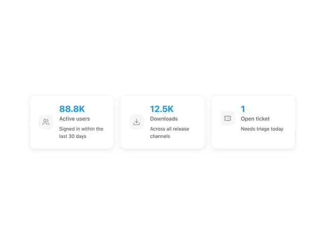
Data Card
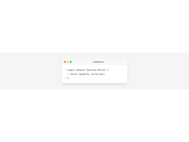
Window Bar
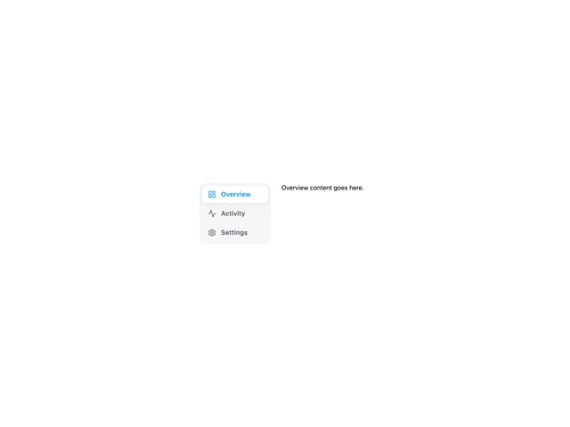
Tabs

Scrollable Data Table
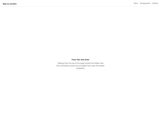
Skip Link
More in Navigation
View all

Liquid Glass Expandable Sidebar
76

Footer with Big Wordmark
40

Sidebar
392

Oversized 404 Numeral
78
Navbar with Theme Toggle
67

NavBar
2

Pagination
109
Tabs like bookmark
82
