
About
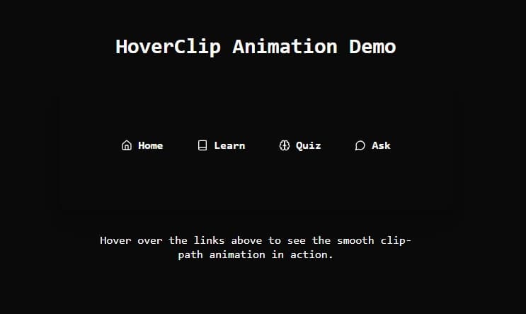
Hover over the links above to see the smooth clip-path animation in action.
Built with React and Tailwind. Copy the prompt and paste it into Claude Code, Cursor or Lovable: your agent adds HoverClip to your project and fits it to your theme.
Code
How HoverClip is used: the demo's code. The component's own source comes with a free account.
Usage.tsx
import { HoverClip } from '@/components/ui/test'

export default function DemoOne() {
  return (
    <div className="bg-background text-foreground min-h-screen flex flex-col leading-tight font-mono items-center justify-center p-10">
      <h1 className="text-3xl font-bold mb-8">
        HoverClip Animation Demo
      </h1>

      {/* Container for hover links */}
      <div className="bg-background p-8 rounded-2xl shadow-xl">
        <HoverClip />
      </div>

      <p className="mt-8 text-foreground text-center max-w-md">
        Hover over the links above to see the smooth clip-path animation in action.
      </p>
    </div>
  )
}
Dependencies
More by Muhammad Kumail Ali
View all
CoreSpin Loader
420
HoloCube Loader
250
Circle unique load
161
Text Reveal Animation
136
Secure Message Gateway
125
HoloPulse Loader
113
Neon Matrix Loader
77
Core Header Navbar
66
More in Navigation
View all

Liquid Glass Expandable Sidebar
76

Footer with Big Wordmark
40

Sidebar
392

Oversized 404 Numeral
78
Navbar with Theme Toggle
67

NavBar
2

Pagination
109
Tabs like bookmark
82
