
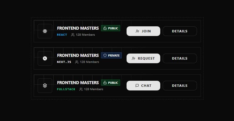
About
A clean and responsive **Group List Card UI** designed to display community groups with type, privacy status, and member count. It includes intuitive action buttons (Join, Request, Chat, Details) and supports multiple group types like React, Next.js, and Full-stack—perfect for modern frontend dashboards and previews.
Built with React and Tailwind. Copy the prompt and paste it into Claude Code, Cursor or Lovable: your agent adds Group List Card to your project and fits it to your theme.
Code
How Group List Card is used: the demo's code. The component's own source comes with a free account.
Usage.tsx
import { GroupListCard, GroupType } from "@/components/ui/group-list-card";

const GROUPS: {
  name: string;
  type: GroupType;
  memberCount: number;
  isPrivate?: boolean;
  allowedUser?: boolean;
}[] = [
  {
    name: "React Developers Hub",
    type: "react",
    memberCount: 342,
  },
  {
    name: "Next.js Builders",
    type: "nextJS",
    memberCount: 189,
    isPrivate: true,
  },
  {
    name: "Full-Stack Engineers",
    type: "fullstack",
    memberCount: 512,
    allowedUser: true,
  },
];

export default function DemoOne() {
  return (
    <div className="space-y-4 p-4 border border-dashed rounded-md">
      {/* Heading */}
      <div>
        <h2 className="text-sm font-bold uppercase tracking-widest text-muted-foreground">
          Groups
        </h2>
        <p className="text-xs text-muted-foreground">
          Explore and join developer communities
        </p>
      </div>

      {/* Group Cards */}
      <div className="space-y-3">
        {GROUPS.map((group, index) => (
          <GroupListCard
            key={index}
            name={group.name}
            type={group.type}
            memberCount={group.memberCount}
            isPrivate={group.isPrivate}
            allowedUser={group.allowedUser}
          />
        ))}
      </div>
    </div>
  );
}
Dependencies
More by Muhammad Kumail Ali
View all
CoreSpin Loader
420
HoloCube Loader
250
Circle unique load
161
Text Reveal Animation
136
Secure Message Gateway
125
HoloPulse Loader
113
Neon Matrix Loader
77
Core Header Navbar
66
More in Buttons
View all
Texture Button
108
Button
14

Notification Button
117

HeroUI Button Group
2

Eclipse Button
44
Button Save
50

App Store Button
484

Base Button
1


