
About
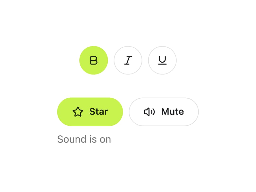
A single button that stays pressed, announced to assistive tech with aria-pressed, for actions like Bold, Mute, Follow or Star that stick on rather than open a dialog or submit a setting.
Built with React and Tailwind. Copy the prompt and paste it into Claude Code, Cursor or Lovable: your agent adds Toggle Button to your project and fits it to your theme.
Code
How Toggle Button is used: the demo's code. The component's own source comes with a free account.
Usage.tsx
"use client";

import { ToggleButton } from "@/components/ui/toggle-button";
import { useState } from "react";
import { Bold, Italic, Underline, Star, Volume2, VolumeX } from "lucide-react";

export default function ToggleButtonDemo() {
  const [muted, setMuted] = useState(false);

  return (
    <div className="flex flex-col items-center gap-8 p-10 bg-background text-foreground">
      <div className="flex items-center gap-2">
        <ToggleButton icon={Bold} iconOnly defaultPressed>
          Bold
        </ToggleButton>
        <ToggleButton icon={Italic} iconOnly>
          Italic
        </ToggleButton>
        <ToggleButton icon={Underline} iconOnly>
          Underline
        </ToggleButton>
      </div>

      <div className="flex flex-col items-start gap-2">
        <div className="flex items-center gap-2">
          <ToggleButton icon={Star} defaultPressed>
            Star
          </ToggleButton>
          <ToggleButton
            icon={Volume2}
            pressedIcon={VolumeX}
            pressed={muted}
            onPressedChange={setMuted}
          >
            Mute
          </ToggleButton>
        </div>
        <p className="text-sm text-muted-foreground">
          {muted ? "Sound is off" : "Sound is on"}
        </p>
      </div>
    </div>
  );
}
Dependencies
More by klyv-ui
View all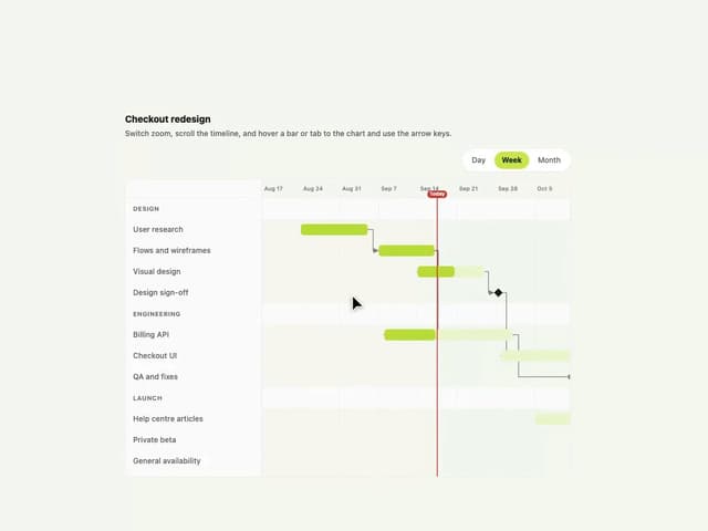
Gantt Chart
97
Shader Canvas
63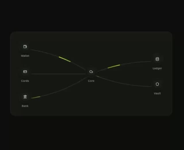
Klyv Animated Beam
62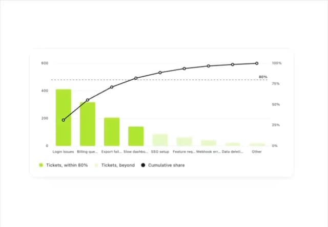
Pareto Chart
58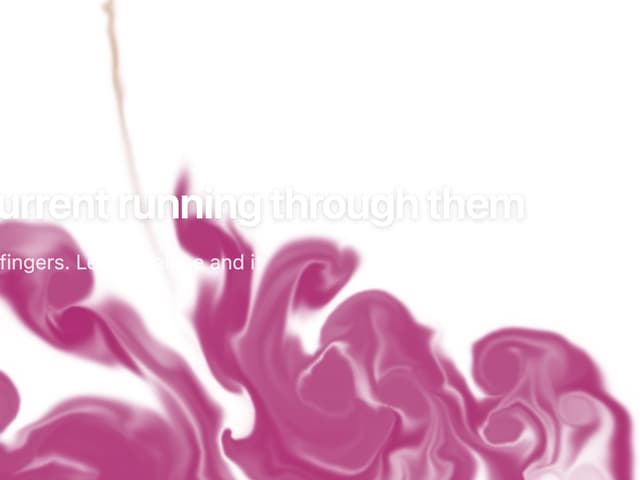
Fluid Canvas
42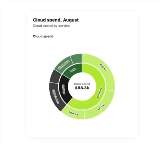
Sunburst Chart
34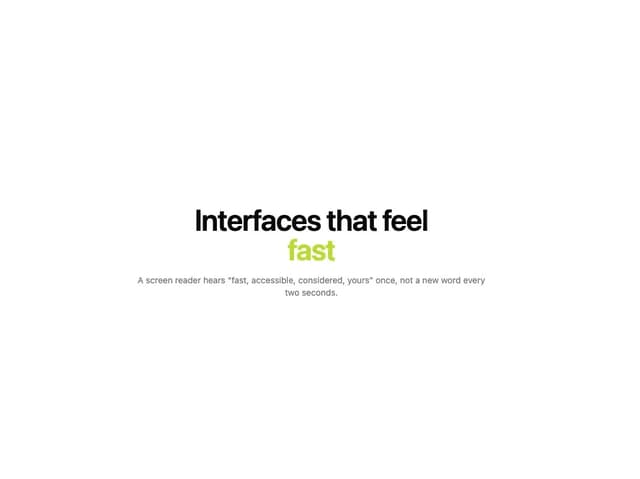
Morphing Text
30
Gooey Loader
29
More in Buttons
View all
Texture Button
108
Button
14

Notification Button
117

HeroUI Button Group
2

Eclipse Button
44
Button Save
50

App Store Button
484

Base Button
1


