
About
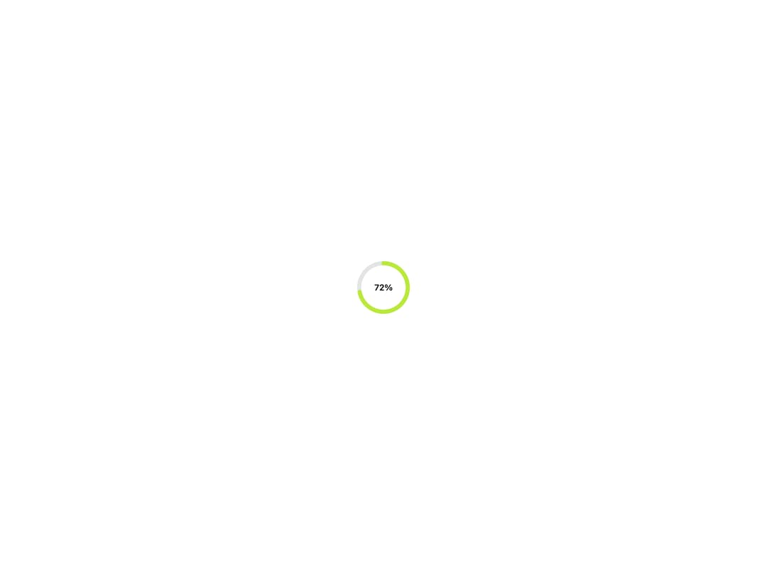
A circular progress indicator that draws a value as an arc, for square slots like a tile corner or compact summary where a bar wouldn't fit.
Built with React and Tailwind. Copy the prompt and paste it into Claude Code, Cursor or Lovable: your agent adds Progress Ring to your project and fits it to your theme.
Code
How Progress Ring is used: the demo's code. The component's own source comes with a free account.
Usage.tsx
import { ProgressRing } from "@/components/ui/progress-ring";

export default function ProgressRingDemo() {
  return (
    <div className="flex min-h-[320px] w-full items-center justify-center bg-background p-10">
      <ProgressRing value={72} label="Profile completeness" size="lg">
        <span className="text-sm font-semibold text-foreground">72%</span>
      </ProgressRing>
    </div>
  );
}
More by klyv-ui
View all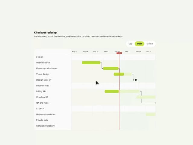
Gantt Chart
97
Shader Canvas
63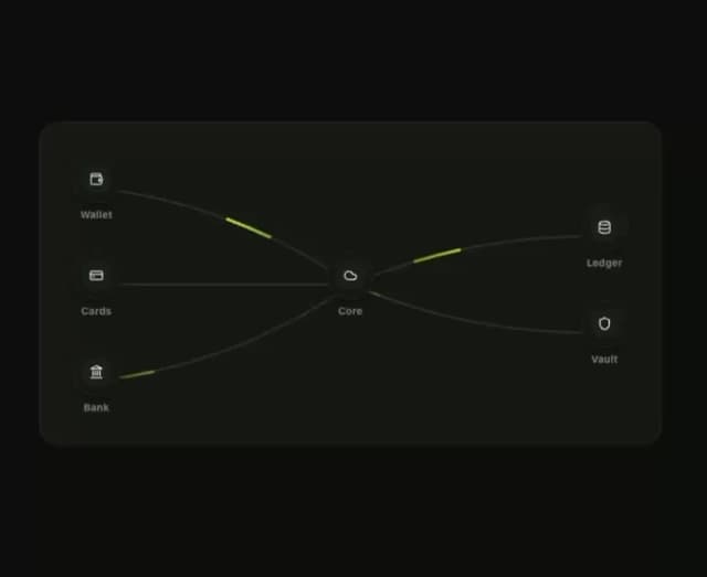
Klyv Animated Beam
62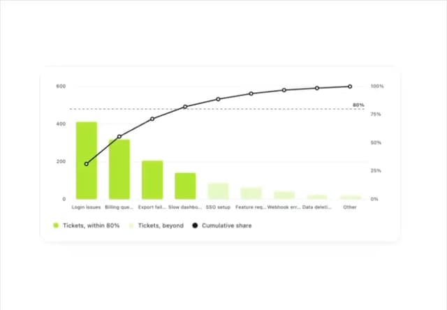
Pareto Chart
58
Fluid Canvas
42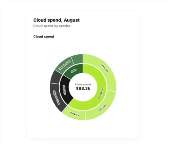
Sunburst Chart
34
Morphing Text
30
Gooey Loader
29