
About
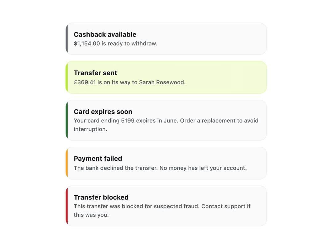
A persistent, dismissible message block with coloured tone rail (neutral, accent, success, warning, danger) for surfacing status updates like failed payments or expiring cards.
Built with React and Tailwind. Copy the prompt and paste it into Claude Code, Cursor or Lovable: your agent adds Alert to your project and fits it to your theme.
Code
How Alert is used: the demo's code. The component's own source comes with a free account.
Usage.tsx
import Alert from "@/components/ui/alert";

export default function AlertTonesDemo() {
  return (
    <div className="flex w-full max-w-md flex-col gap-3 p-6">
      <Alert tone="neutral" title="Cashback available">
        $1,154.00 is ready to withdraw.
      </Alert>
      <Alert tone="accent" title="Transfer sent">
        £369.41 is on its way to Sarah Rosewood.
      </Alert>
      <Alert tone="success" title="Card expires soon">
        Your card ending 5199 expires in June. Order a replacement to avoid
        interruption.
      </Alert>
      <Alert tone="warning" title="Payment failed" live>
        The bank declined the transfer. No money has left your account.
      </Alert>
      <Alert tone="danger" title="Transfer blocked" live>
        This transfer was blocked for suspected fraud. Contact support if this
        was you.
      </Alert>
    </div>
  );
}
More by klyv-ui
View all
Gantt Chart
97
Shader Canvas
63
Klyv Animated Beam
62
Pareto Chart
58
Fluid Canvas
42
Sunburst Chart
34
Morphing Text
30
Gooey Loader
29