
About
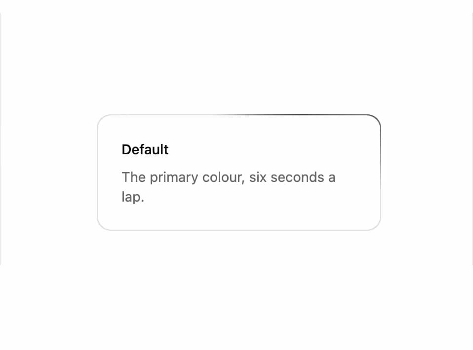
A card or container border with a glowing light that travels around its edge, used to draw attention to featured content.
Built with React and Tailwind. Copy the prompt and paste it into Claude Code, Cursor or Lovable: your agent adds Animated Border to your project and fits it to your theme.
Code
How Animated Border is used: the demo's code. The component's own source comes with a free account.
Usage.tsx
import { AnimatedBorder } from "@/components/ui/animated-border";

export default function AnimatedBorderDemo() {
  return (
    <div className="flex min-h-[320px] w-full items-center justify-center p-10">
      <AnimatedBorder className="w-72">
        <div className="flex flex-col gap-2 p-6">
          <h3 className="text-sm font-medium">Default</h3>
          <p className="text-sm text-muted-foreground">
            The primary colour, six seconds a lap.
          </p>
        </div>
      </AnimatedBorder>
    </div>
  );
}
More by kevingirelli
View all
Aurora
131
QR Code
128
FAQ Section
79
Warp Gradient
63
Corner Frame
59
Wave Text
56
Spotlight
47
Flip Text
34
More in Cards
View all

Course Design Cards
1.3K

Statistics Card 7
327
Statistics Card 2
305

Interactive Tech Stack Bento Grid with Hover Effects
625

Card Studio
5
The Item one
4

Weather Card
65

Card
9