
About
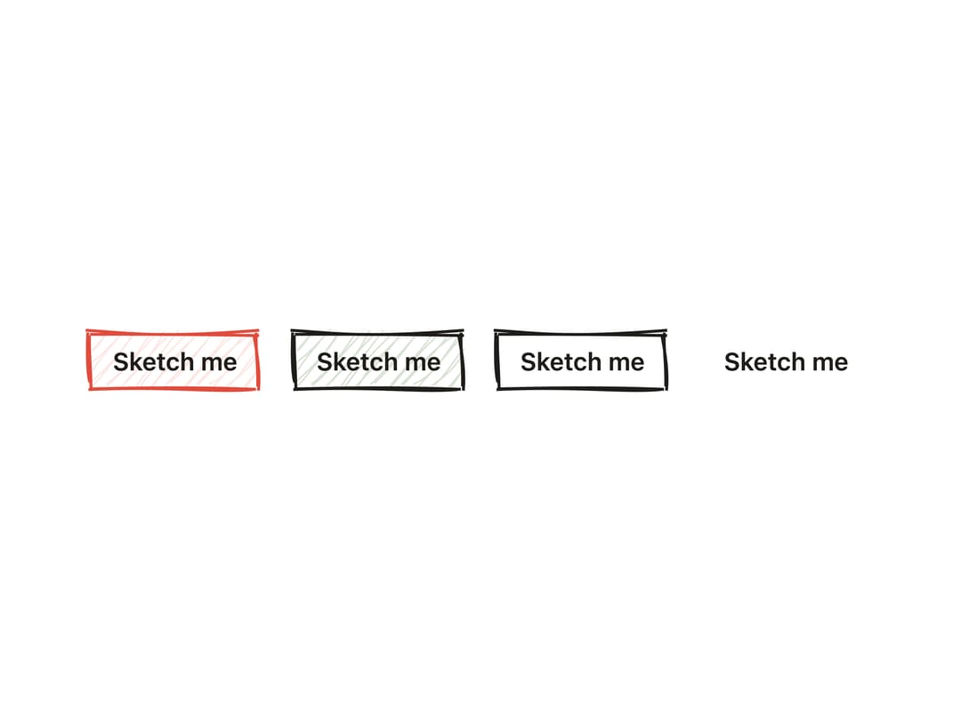
A clickable button whose border and fill look hand-drawn with a wobbly rough.js sketch outline, supporting primary/secondary/outline/ghost styles, sizes, icons and a loading spinner.
Built with React and Tailwind. Copy the prompt and paste it into Claude Code, Cursor or Lovable: your agent adds Sketch Button to your project and fits it to your theme.
Code
How Sketch Button is used: the demo's code. The component's own source comes with a free account.
Usage.tsx
import Button from "@/components/ui/sketch-button";

export default function SketchButtonDemo() {
  return (
    <div className="flex w-full flex-wrap items-center justify-center gap-4 p-10">
      <Button seed={42} animate={false} variant="primary">
        Sketch me
      </Button>
      <Button seed={42} animate={false} variant="secondary">
        Sketch me
      </Button>
      <Button seed={42} animate={false} variant="outline">
        Sketch me
      </Button>
      <Button seed={42} animate={false} variant="ghost">
        Sketch me
      </Button>
    </div>
  );
}
Dependencies
More by kanchanasw
View all
Sketch Tabs
145
Hand-Drawn Checkbox
74
Sketch Textarea
67
Sketch Hover Card
53
Pagination
10
Radial Menu
7
Sketch Prompt Input
2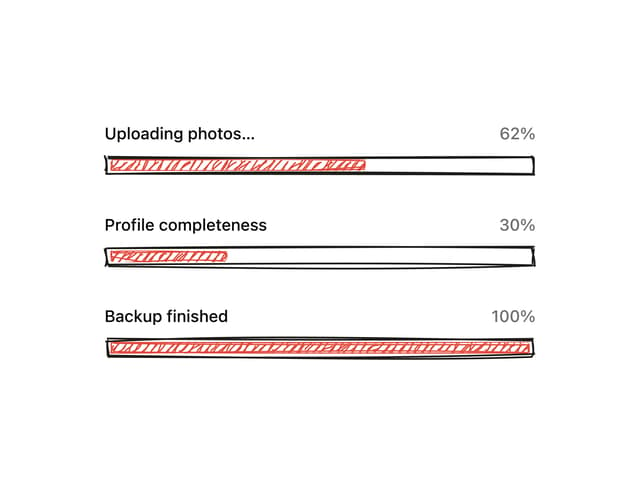
Hand-Drawn Progress Bar
1
More in Buttons
View all
Texture Button
108
Button
14

Notification Button
117

HeroUI Button Group
2

Eclipse Button
44
Button Save
50

App Store Button
484

Base Button
1


