
About
Product grid card with square cover image, vendor badge, headline, and sale-price strike-through. Hover-zoom on image, rounded-lg surface, ready for catalog grids.
Built with React and Tailwind. Copy the prompt and paste it into Claude Code, Cursor or Lovable: your agent adds ProductCard to your project and fits it to your theme.
Code
How ProductCard is used: the demo's code. The component's own source comes with a free account.
Usage.tsx
import { ProductCard as PublishedComponent } from "@/components/ui/product-card"

export default function Demo() {
  return <PublishedComponent />
}
Dependencies
More by jason-mohabali
View all

Path to Resilience Orbital Timeline
135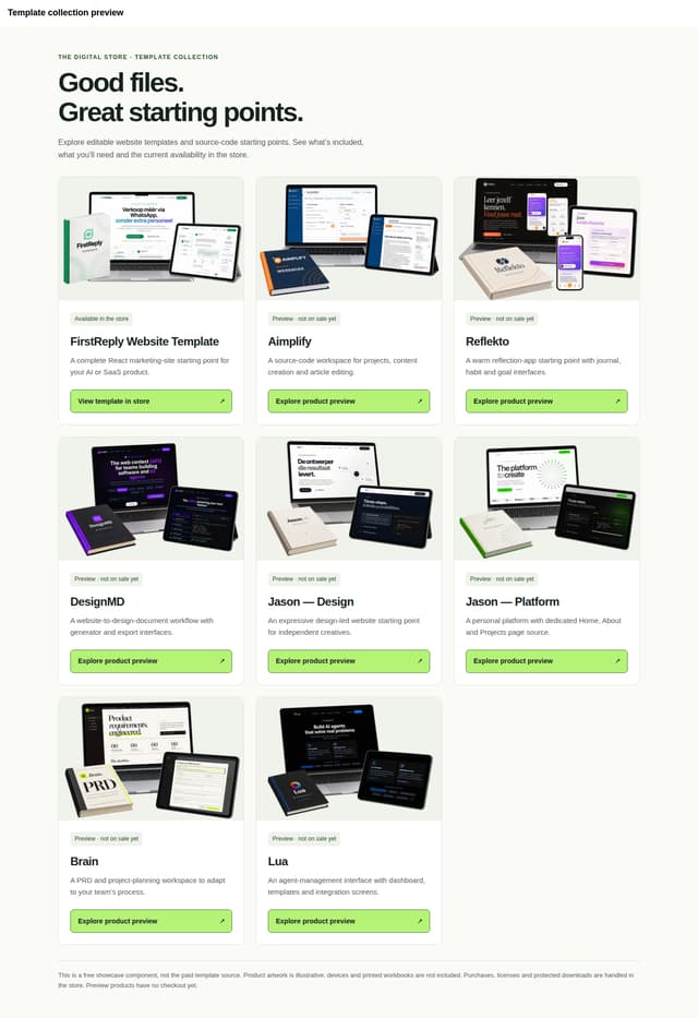
The Digital Store — Template Showcase
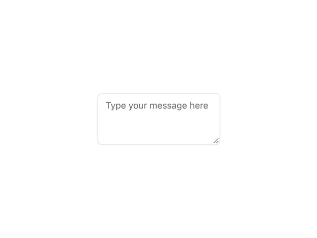
Aidimension Ui Textarea

Aidimension Ui Switch
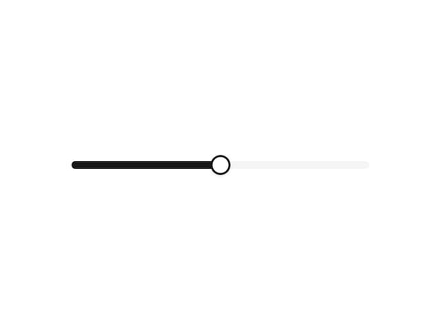
Aidimension Ui Slider

Aidimension Ui Select

Aidimension Ui Tabs
Aidimension Ui Separator
More in Cards
View all

Course Design Cards
1.3K

Statistics Card 7
327
Statistics Card 2
305

Interactive Tech Stack Bento Grid with Hover Effects
625

Card Studio
5
The Item one
4

Weather Card
65

Card
9