
About
Thin wrapper around next-themes ThemeProvider with sane defaults for light + dark mode (attribute='class', defaultTheme='system'). Drop into the root layout.
Built with React and Tailwind. Copy the prompt and paste it into Claude Code, Cursor or Lovable: your agent adds ThemeProvider to your project and fits it to your theme.
Code
How ThemeProvider is used: the demo's code. The component's own source comes with a free account.
Usage.tsx
import ThemeProviderinline from "@/components/ui/theme-provider"

export default function Demo() {
  return <ThemeProviderinline />
}
Dependencies
More by Jason Mohab-Ali
View all

Path to Resilience Orbital Timeline
46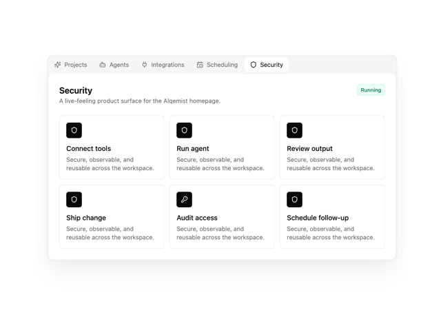
Alqemist Interactive Demo
12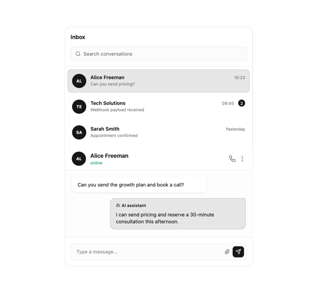
What Saa SChat Inbox
12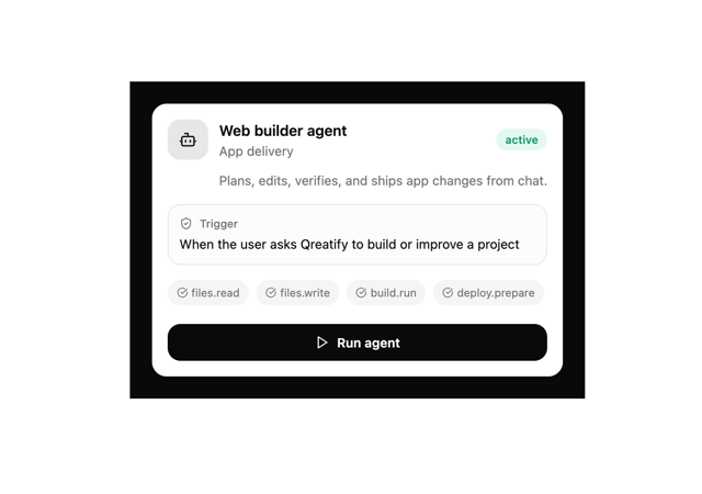
Qreatify Super Agent Card
6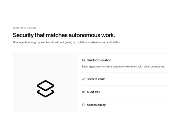
Alqemist Security
5
Alqemist Hero
4
Path to Resilience Partnership Section
3
Path to Resilience Workflow Grid
3