
About
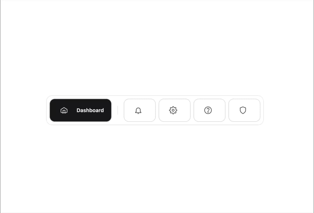
A modern, responsive menu bar React component featuring animated icon expansion, active state highlighting, and smooth transitions. Supports both dark and light themes out of the box using Tailwind CSS. On mobile, tooltips appear on tap for accessible navigation. Designed for clean code, accessibility, and seamless integration into any Next.js or React project.
Built with React and Tailwind. Copy the prompt and paste it into Claude Code, Cursor or Lovable: your agent adds Animated Menu Bar to your project and fits it to your theme.
Code
How Animated Menu Bar is used: the demo's code. The component's own source comes with a free account.
Usage.tsx
import { MenuBar } from "@/components/ui/animated-menu-bar";
import React, { useState } from 'react'

const menuItems = [
  'dashboard',
  'notifications',
  'settings',
  'help',
  'security',
] as const;
type MenuItem = typeof menuItems[number];

export default function DemoOne() {
    const [active, setActive] = useState<MenuItem>('dashboard');
  return  <MenuBar active={active} onSelect={setActive} />;
}
More by Ankit Verma
View all

Stack Card
319
File Uploader
76
Scroll-linked spring animation
56
Error 404 Page
56
Dialog box
22
Path morphing
20
Pricing Page
5
3D Card
1
More in Buttons
View all
Texture Button
108
Button
14

Notification Button
117

HeroUI Button Group
2

Eclipse Button
44
Button Save
50

App Store Button
484

Base Button
1


