

About
Fullscreen image carousel with a NEXT preview that rides the cursor. Click and the preview expands from the cursor to fill the screen; rapid clicks stack nested frames. Rolling titles and slide counter, GSAP-driven, keyboard and touch accessible, reduced-motion crossfade.
Built with React and Tailwind. Copy the prompt and paste it into Claude Code, Cursor or Lovable: your agent adds Portal Carousel to your project and fits it to your theme.
Code
How Portal Carousel is used: the demo's code. The component's own source comes with a free account.
Usage.tsx
"use client";

import PortalCarousel, { type PortalCarouselImage } from "@/components/ui/portal-carousel";

const ASSETS = "https://pub-8abee449136941f5b0a1cd2c014534e9.r2.dev/vault-listing-images/assets-images/portal-carousel";

const images: PortalCarouselImage[] = [
  { src: `${ASSETS}/crimson-drift.jpg`, title: "Crimson Drift", alt: "Woman tossing her hair in red and amber light, motion-blurred" },
  { src: `${ASSETS}/night-rider.jpg`, title: "Night Rider", alt: "Cyclist in an orange jacket panning past city lights at night" },
  { src: `${ASSETS}/light-trails.jpg`, title: "Light Trails", alt: "Dark SUV streaking past with headlight trails" },
  { src: `${ASSETS}/ember-motion.jpg`, title: "Ember Motion", alt: "Dancers blurred mid-movement in an orange-lit room" },
  { src: `${ASSETS}/platform-wind.jpg`, title: "Platform Wind", alt: "Woman on a subway platform, hair swept by a passing train" },
];

const settings = {
  label: "Next",
  thumbWidth: 200,
  followSpeed: 0.14,
  duration: 1.2,
};

export default function PortalCarouselDemo(props: Partial<typeof settings>) {
  const s = { ...settings, ...props };

  return (
    <PortalCarousel
      images={images}
      label={s.label}
      thumbWidth={s.thumbWidth}
      followSpeed={s.followSpeed}
      duration={s.duration}
    />
  );
}
Dependencies
More by Hyperiux Vault
View all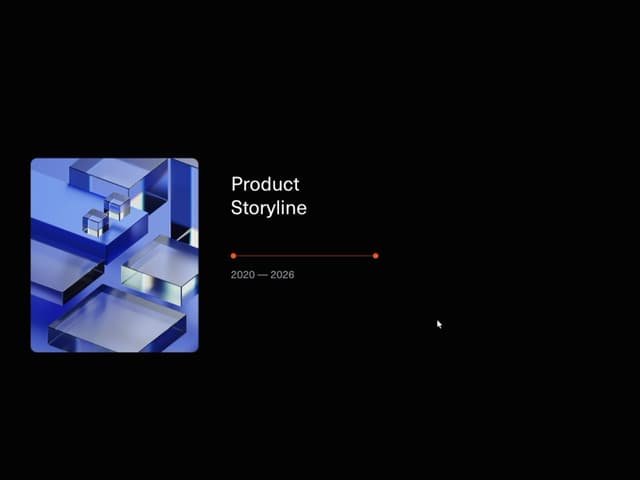

Product Timeline
2.6K
Stack Spread
1.3K
Arrow Fill Button
1K
Shiny Button
963
Interactive List Preview
904
Circular Split Roll
761
Zoom Slider
533
Metallic Button
438
More in Galleries
View all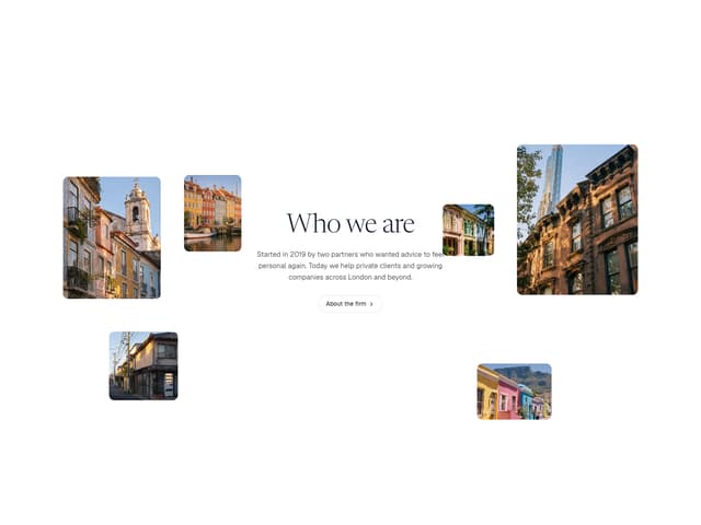

Scattered About
14

Animated Gallery
1.5K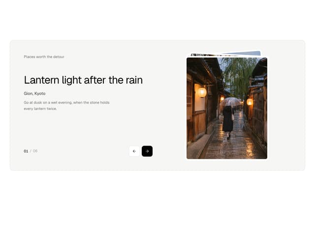
Photo Deck
4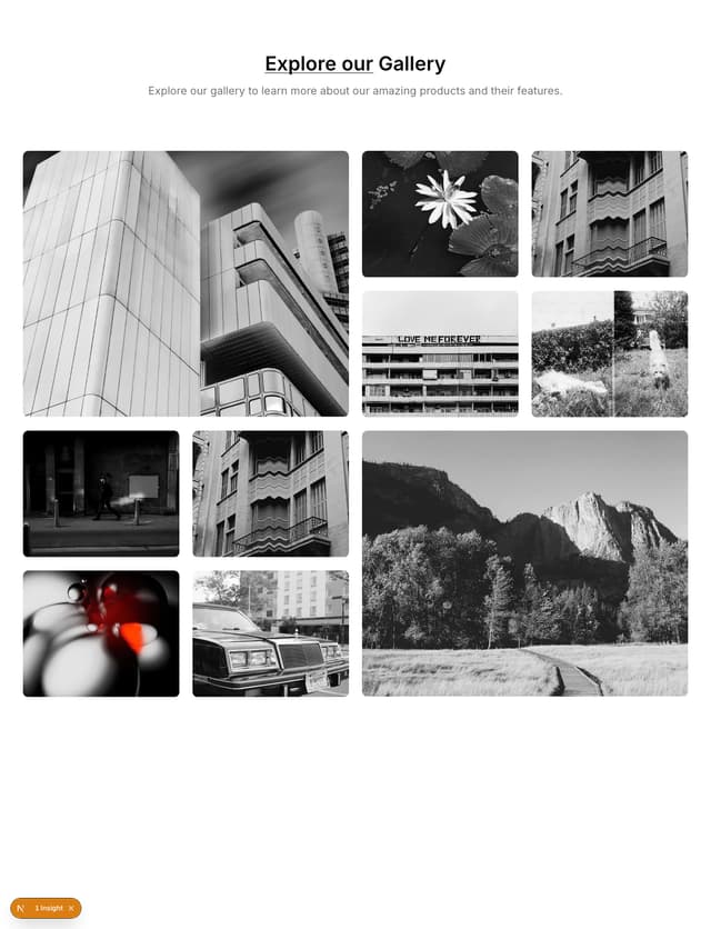

Gallery Component
5
Editorial Collage Hero
507

Elastic Gallery
1.1K

Image Gallery
130
Folded Card
42
