
About
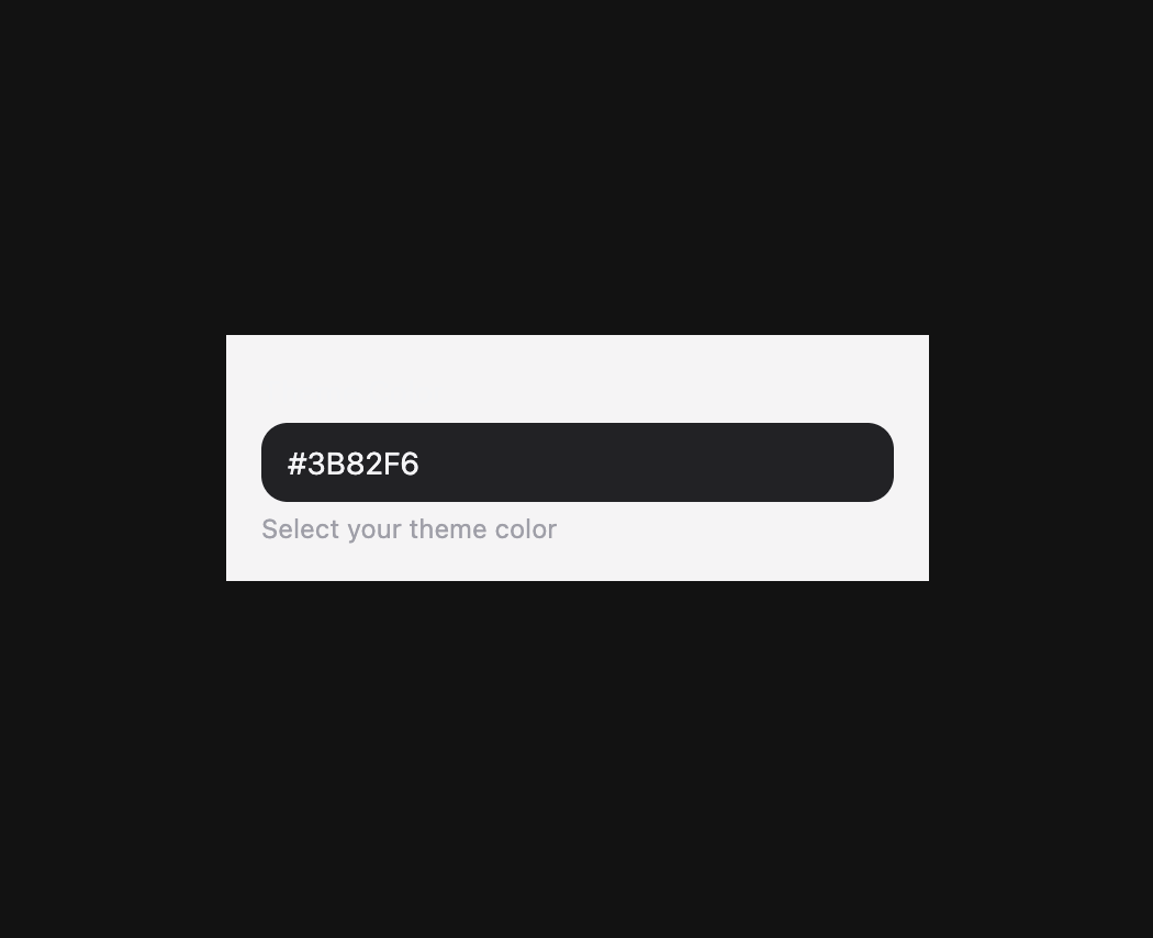
Color input field with labels, descriptions, validation, and HSL channel editing.
Built with React and Tailwind. Copy the prompt and paste it into Claude Code, Cursor or Lovable: your agent adds ColorField to your project and fits it to your theme.
Code
How ColorField is used: the demo's code. The component's own source comes with a free account.
Usage.tsx
import { ColorField, Description, Label, Surface } from "@/components/ui/heroui-color-field";

export default function OnSurface() {
  return (
    <div className="flex min-h-screen w-full items-center justify-center overflow-hidden bg-background p-8">
      <Surface className="w-[320px] p-4">
        <ColorField defaultValue="#3B82F6" name="color">
          <Label>Theme Color</Label>
          <ColorField.Group variant="secondary">
            <ColorField.Input />
          </ColorField.Group>
          <Description>Select your theme color</Description>
        </ColorField>
      </Surface>
    </div>
  );
}

export { OnSurface };
More by Hero Ui
View all

DatePicker
471
Chip
448
The Pagination
366
HeroUI Table
122
HeroUI Color Picker
114
Skeleton
106
HeroUI Disclosure Group
97
HeroUI AlertDialog
83
More in Forms
View all

Login 1
63

Premium Auth
570

Contact Card
1.1K

Form
18

Book A Demo 1
91
Authentication Card
52

Card Studio
47

Login Card
35
