
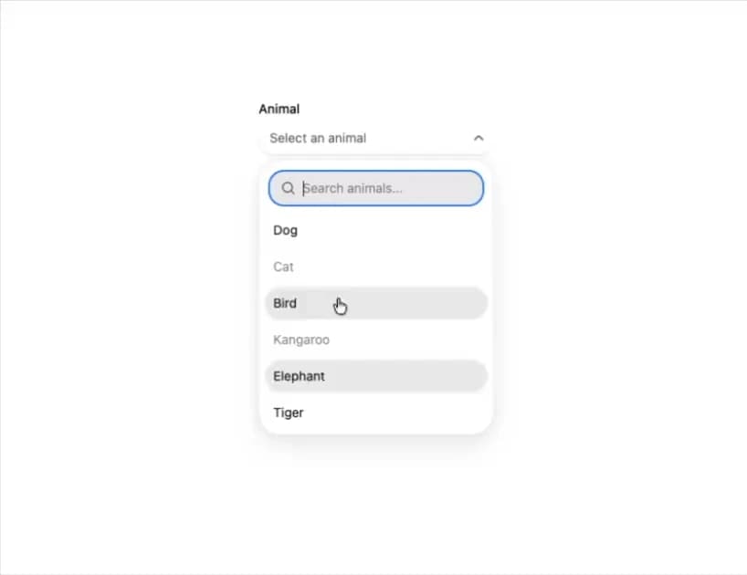
HeroUI v3 Autocomplete is a searchable select that filters a ListBox of options as you type, supporting single and multiple selection with removable tags, grouped sections, disabled options, descriptions, form validation, controlled state, custom trigger values with avatars, and full-width layouts inside a Surface. Built on the real @heroui/react package with @heroui/styles, it composes with SearchField, ListBox, TagGroup, Label, Description, FieldError and useFilter. A thin re-export of the upstream component so consumers install and render the genuine HeroUI primitive.
Built with React and Tailwind. Copy the prompt and paste it into Claude Code, Cursor or Lovable: your agent adds HeroUI Autocomplete to your project and fits it to your theme.
Code
How HeroUI Autocomplete is used: the demo's code. The component's own source comes with a free account.
Usage.tsx
"use client"

import type { Key } from "@heroui/react"

import { EmptyState, Label, ListBox, SearchField, useFilter } from "@heroui/react"
import { useState } from "react"
import { Autocomplete } from "@/components/ui/heroui-autocomplete"

export function WithDisabledOptions() {
  const [selectedKey, setSelectedKey] = useState<Key | null>(null)
  const { contains } = useFilter({ sensitivity: "base" })

  return (
    <Autocomplete
      className="w-[256px]"
      disabledKeys={["cat", "kangaroo"]}
      placeholder="Select an animal"
      selectionMode="single"
      value={selectedKey}
      onChange={setSelectedKey}
    >
      <Label>Animal</Label>
      <Autocomplete.Trigger>
        <Autocomplete.Value />
        <Autocomplete.ClearButton />
        <Autocomplete.Indicator />
      </Autocomplete.Trigger>
      <Autocomplete.Popover>
        <Autocomplete.Filter filter={contains}>
          <SearchField autoFocus name="search" variant="secondary">
            <SearchField.Group>
              <SearchField.SearchIcon />
              <SearchField.Input placeholder="Search animals..." />
              <SearchField.ClearButton />
            </SearchField.Group>
          </SearchField>
          <ListBox renderEmptyState={() => <EmptyState>No results found</EmptyState>}>
            <ListBox.Item id="dog" textValue="Dog">
              Dog
              <ListBox.ItemIndicator />
            </ListBox.Item>
            <ListBox.Item id="cat" textValue="Cat">
              Cat
              <ListBox.ItemIndicator />
            </ListBox.Item>
            <ListBox.Item id="bird" textValue="Bird">
              Bird
              <ListBox.ItemIndicator />
            </ListBox.Item>
            <ListBox.Item id="kangaroo" textValue="Kangaroo">
              Kangaroo
              <ListBox.ItemIndicator />
            </ListBox.Item>
            <ListBox.Item id="elephant" textValue="Elephant">
              Elephant
              <ListBox.ItemIndicator />
            </ListBox.Item>
            <ListBox.Item id="tiger" textValue="Tiger">
              Tiger
              <ListBox.ItemIndicator />
            </ListBox.Item>
          </ListBox>
        </Autocomplete.Filter>
      </Autocomplete.Popover>
    </Autocomplete>
  )
}

export default WithDisabledOptions
Dependencies
More by Hero Ui
View all

DatePicker
471
Chip
448
The Pagination
366
HeroUI Table
122
HeroUI Color Picker
114
Skeleton
106
HeroUI Disclosure Group
97
HeroUI AlertDialog
83
More in Forms
View all

Login 1
64

Premium Auth
571

Contact Card
1.1K

Form
18

Book A Demo 1
91
Authentication Card
52

Card Studio
47

Login Card
35
