
About
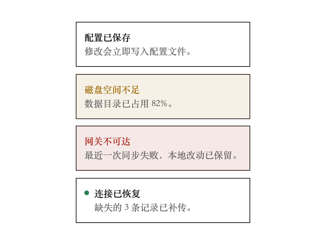
An inline, outlined banner for surfacing a status that needs user attention (like low disk space or an unreachable gateway) next to the affected content, with an optional status dot, dismiss button and action slot.
Built with React and Tailwind. Copy the prompt and paste it into Claude Code, Cursor or Lovable: your agent adds Status Banner to your project and fits it to your theme.
Code
How Status Banner is used: the demo's code. The component's own source comes with a free account.
Usage.tsx
import ZBanner from "@/components/ui/zbanner";

export default function ZBannerTonesDemo() {
  return (
    <div className="flex flex-col gap-3">
      <ZBanner title="配置已保存" tone="neutral">
        修改会立即写入配置文件。
      </ZBanner>
      <ZBanner title="磁盘空间不足" tone="warn">
        数据目录已占用 82%。
      </ZBanner>
      <ZBanner title="网关不可达" tone="danger">
        最近一次同步失败,本地改动已保留。
      </ZBanner>
      <ZBanner title="连接已恢复" tone="ok" dot>
        缺失的 3 条记录已补传。
      </ZBanner>
    </div>
  );
}
More by hemingtsai
View all
ZCheckbox
Floating Action Button
Button Group