
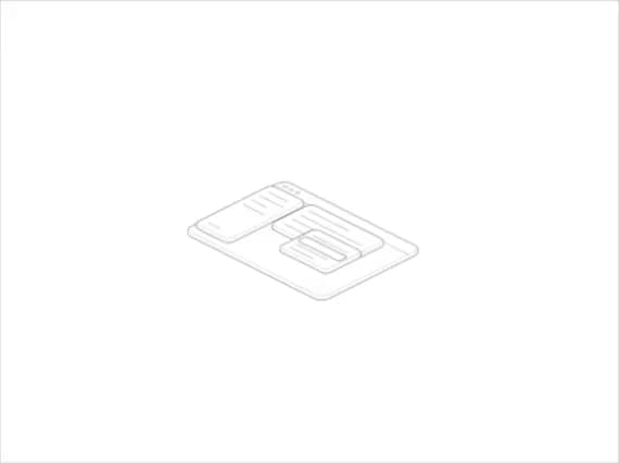
About
An isometric app-window diagram split into four draggable layers (surface, sidebar, card, popover) that spreads apart and highlights the layer under the pointer, for illustrating app architecture or empty states.
Built with React and Tailwind. Copy the prompt and paste it into Claude Code, Cursor or Lovable: your agent adds Hairline Exploded to your project and fits it to your theme.
Code
How Hairline Exploded is used: the demo's code. The component's own source comes with a free account.
Usage.tsx
import Exploded from "@/components/ui/hairline-exploded";

export default function HairlineExplodedDemo() {
  return (
    <div className="flex min-h-screen w-full items-center justify-center bg-background p-10">
      <Exploded className="w-full max-w-sm text-foreground" />
    </div>
  );
}
More by Lucas
View all
Hairline Riffle
179
Basket Figure
85
Hairline Terrain
83
Lockers
80
Padlock
66
Hairline Slow
66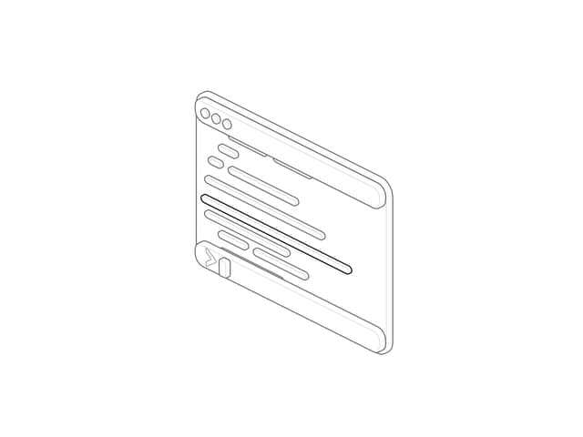
Hairline Terminal
65
Hairline Drawer
60