
About
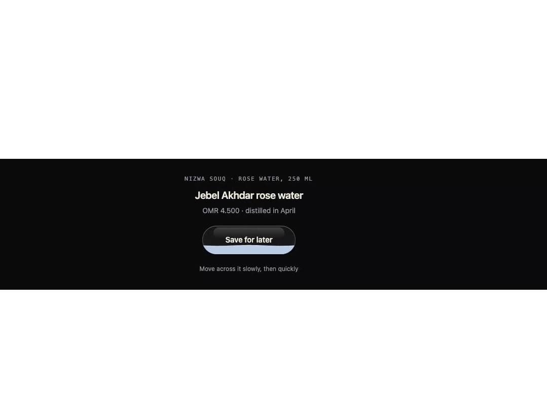
A toggle button shaped like a glass capsule partly filled with liquid that sloshes and tips as you move your cursor across it, filling to the brim and showing a done label when pressed.
Built with React and Tailwind. Copy the prompt and paste it into Claude Code, Cursor or Lovable: your agent adds Slosh Button to your project and fits it to your theme.
Code
How Slosh Button is used: the demo's code. The component's own source comes with a free account.
Usage.tsx
"use client";

import { SloshButton } from "@/components/ui/slosh-button";

export default function SloshButtonDemo() {
  return (
    <div className="flex min-h-full w-full items-center justify-center p-8 bg-[#0b0a0d]">
      <div className="flex flex-col items-center gap-5 text-center">
        <div>
          <p className="font-mono text-[0.6875rem] uppercase tracking-[0.14em] text-[#9c96a1]">
            Nizwa Souq · Rose water, 250 ml
          </p>
          <p className="mt-2 text-[1.25rem] font-semibold tracking-[-0.02em] text-[#efe8dc]">
            Jebel Akhdar rose water
          </p>
          <p className="mt-1 text-[0.875rem] text-[#9c96a1]">
            OMR 4.500 · distilled in April
          </p>
        </div>
        <SloshButton theme="night" label="Save for later" doneLabel="Saved" />
        <p className="text-[0.75rem] text-[#9c96a1]">
          Move across it slowly, then quickly
        </p>
      </div>
    </div>
  );
}
More by ham7a311
View all
Wave Mesh
185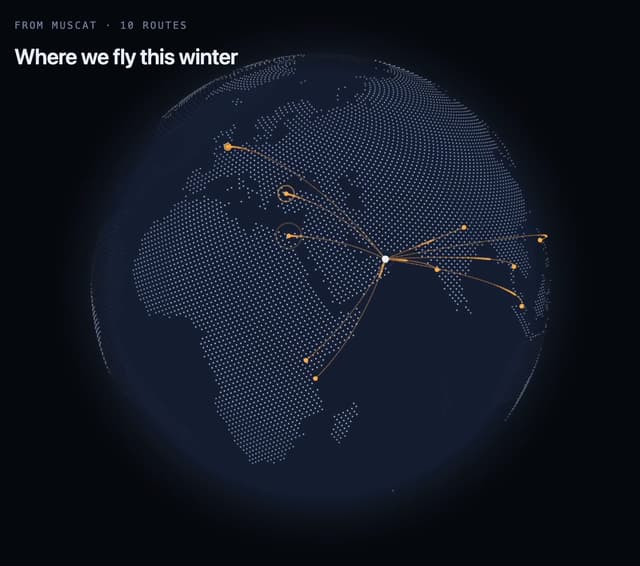
Route Globe
154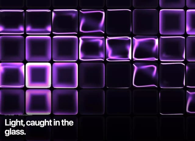
Glass Tiles
146
Glyph Swell
60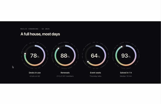
Orbit Ring Stats
57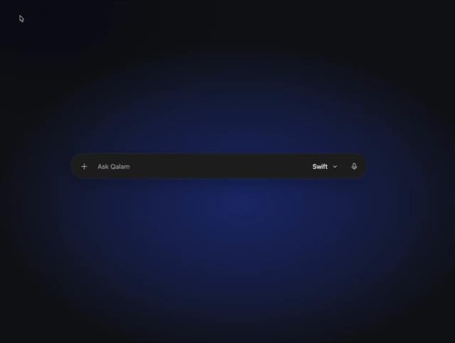
Ask Bar
46
Intent Label
39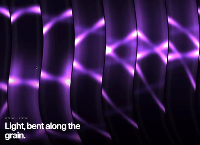
Glass Ribbons
37
More in Buttons
View all
Texture Button
108
Button
14

Notification Button
117

HeroUI Button Group
2

Eclipse Button
44
Button Save
50

App Store Button
484

Base Button
1


