
About
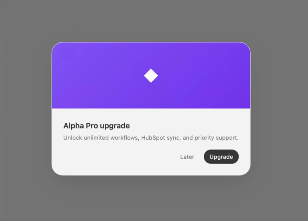
A centered modal overlay for confirmations, with form and cover-image card variants, that traps focus and closes on Escape or an outside click.
Built with React and Tailwind. Copy the prompt and paste it into Claude Code, Cursor or Lovable: your agent adds Dialog to your project and fits it to your theme.
Code
How Dialog is used: the demo's code. The component's own source comes with a free account.
Usage.tsx
"use client";

import { CardDialog } from "@/components/ui/halaska-dialog";
import { useState } from "react";

const ghostBtn: React.CSSProperties = {
  height: 30,
  padding: "0 12px",
  borderRadius: 16,
  border: "none",
  background: "transparent",
  color: "#888888",
  fontSize: 12,
  fontWeight: 500,
  fontFamily: "system-ui, sans-serif",
  cursor: "pointer",
};
const primaryBtn: React.CSSProperties = {
  height: 30,
  padding: "0 12px",
  borderRadius: 16,
  border: "none",
  background: "#3d3d3d",
  color: "#ffffff",
  fontSize: 12,
  fontWeight: 500,
  fontFamily: "system-ui, sans-serif",
  cursor: "pointer",
};
const outlineBtn: React.CSSProperties = {
  height: 30,
  padding: "0 12px",
  borderRadius: 16,
  border: "1.5px solid rgba(0,0,0,0.06)",
  background: "transparent",
  color: "#3d3d3d",
  fontSize: 12,
  fontWeight: 500,
  fontFamily: "system-ui, sans-serif",
  cursor: "pointer",
};

export default function CardDialogDemo() {
  const [open, setOpen] = useState(false);
  return (
    <div className="flex min-h-[320px] w-full items-center justify-center">
      <button style={outlineBtn} onClick={() => setOpen(true)}>
        Card
      </button>
      <CardDialog
        open={open}
        onClose={() => setOpen(false)}
        cover="◆"
        title="Alpha Pro upgrade"
        description="Unlock unlimited workflows, HubSpot sync, and priority support."
        actions={
          <>
            <button style={ghostBtn} onClick={() => setOpen(false)}>
              Later
            </button>
            <button style={primaryBtn} onClick={() => setOpen(false)}>
              Upgrade
            </button>
          </>
        }
      />
    </div>
  );
}
More by halaska-studio
View all
Dot Grid
48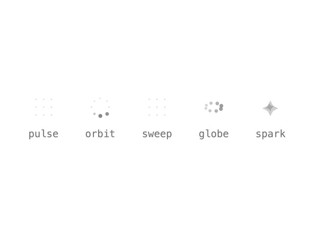
Orb
22
Segmented Control
18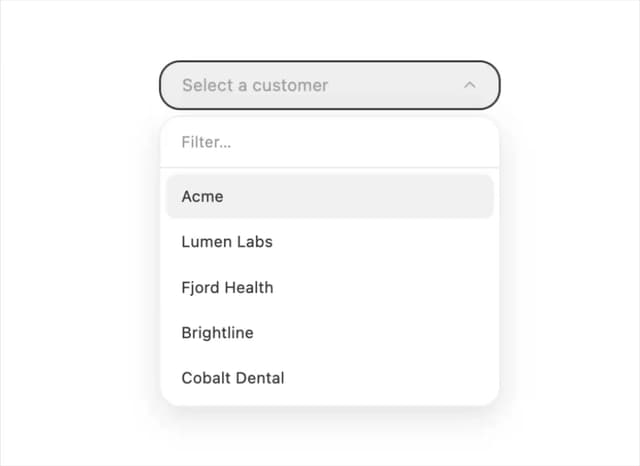
Combobox
12
Choicebox
11
Table
6
Input OTP
6
Switch
5
More in Cards
View all

Course Design Cards
1.3K

Statistics Card 7
327
Statistics Card 2
305

Interactive Tech Stack Bento Grid with Hover Effects
625

Card Studio
5
The Item one
4

Weather Card
65

Card
9