
About
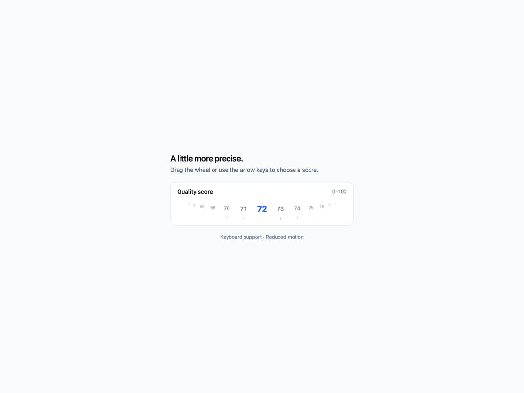
An interactive score wheel with English digits, keyboard controls, sound feedback, and light and dark themes.
Built with React and Tailwind. Copy the prompt and paste it into Claude Code, Cursor or Lovable: your agent adds Rating Score Picker to your project and fits it to your theme.
Code
How Rating Score Picker is used: the demo's code. The component's own source comes with a free account.
Usage.tsx
"use client";

import { useState } from "react";
import RatingScorePicker from "@/components/ui/rating-score-picker";

export default function RatingScorePickerDemo() {
  const [score, setScore] = useState("72");

  return (
    <div className="flex min-h-screen w-full items-center justify-center bg-slate-50 p-6 text-slate-950 dark:bg-slate-950 dark:text-slate-50">
      <div className="w-full max-w-md space-y-5">
        <header className="space-y-1">
          <h1 className="text-xl font-semibold tracking-tight">A little more precise.</h1>
          <p className="text-sm text-slate-600 dark:text-slate-400">Drag the wheel or use the arrow keys to choose a score.</p>
        </header>
        <div className="space-y-3">
          <section className="overflow-hidden rounded-2xl border border-slate-200 bg-white px-4 pb-2 pt-3 dark:border-slate-800 dark:bg-slate-900" aria-labelledby="interactive-label">
            <div className="flex items-center justify-between gap-2 text-sm">
              <h2 id="interactive-label" className="font-medium">Quality score</h2>
              <span className="text-xs text-slate-500 dark:text-slate-400">0–100</span>
            </div>
            <RatingScorePicker value={score} label="Quality score" onChange={setScore} disabled={false} readOnly={false} invalid={false} inputDisabled />
          </section>
        </div>
        <p className="text-center text-xs text-slate-500 dark:text-slate-400">Keyboard support · Reduced motion</p>
      </div>
    </div>
  );
}