
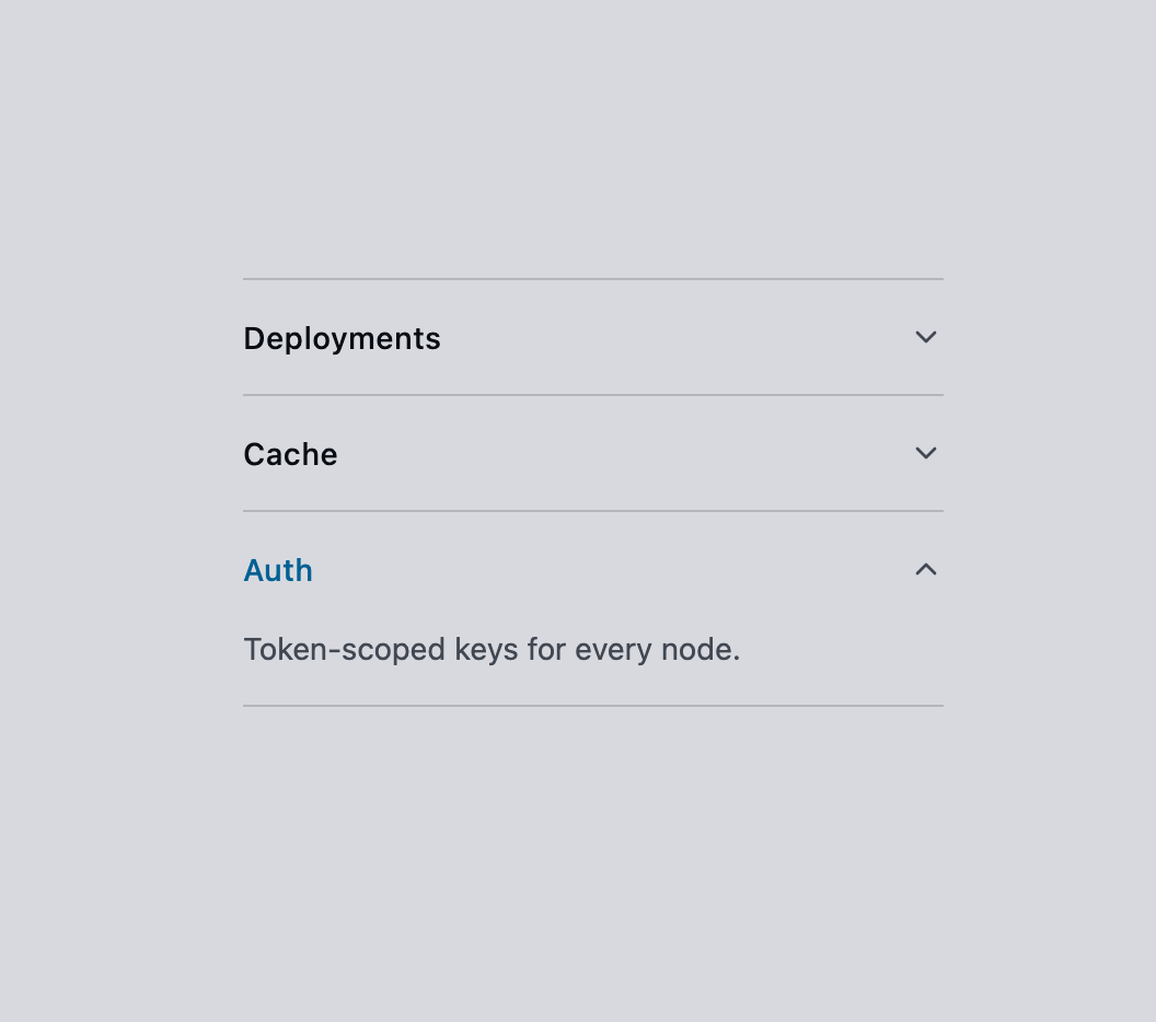
About
A vertically stacked, collapsible set of panels for toggling the visibility of grouped content sections, with a glowing neon accent on the active trigger.
Built with React and Tailwind. Copy the prompt and paste it into Claude Code, Cursor or Lovable: your agent adds Accordion to your project and fits it to your theme.
Code
How Accordion is used: the demo's code. The component's own source comes with a free account.
Usage.tsx
"use client";

import {
  Accordion,
  AccordionContent,
  AccordionItem,
  AccordionTrigger,
} from "@/components/ui/accordion";

export default function AccordionDemo() {
  return (
    <div className="flex w-full items-center justify-center bg-background p-10 text-foreground">
      <Accordion type="single" collapsible className="w-80">
        <AccordionItem value="deploy">
          <AccordionTrigger>Deployments</AccordionTrigger>
          <AccordionContent>
            Ship presets to the mesh in one command.
          </AccordionContent>
        </AccordionItem>
        <AccordionItem value="cache">
          <AccordionTrigger>Cache</AccordionTrigger>
          <AccordionContent>
            Registry resolution cached for 24 hours.
          </AccordionContent>
        </AccordionItem>
        <AccordionItem value="auth">
          <AccordionTrigger>Auth</AccordionTrigger>
          <AccordionContent>Token-scoped keys for every node.</AccordionContent>
        </AccordionItem>
      </Accordion>
    </div>
  );
}
Dependencies
More by ghaerdi
View all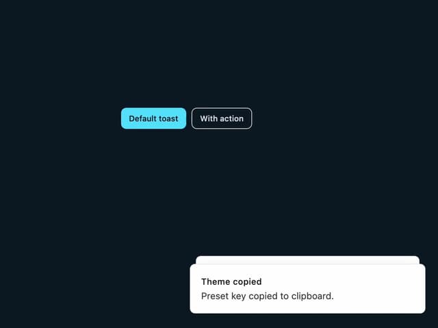
Toast Notification
3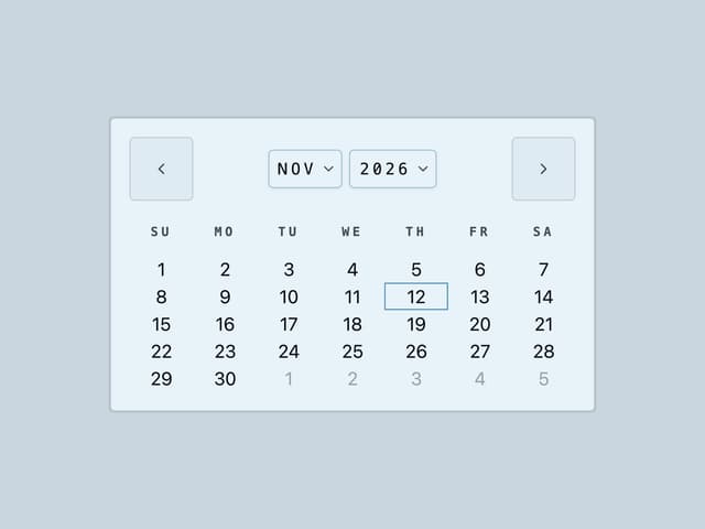
Calendar
Neon Glass Select
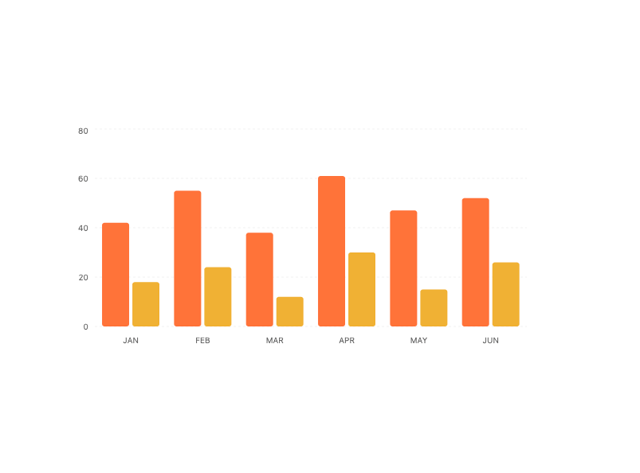
Chart
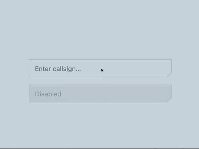
Carved Neon Input
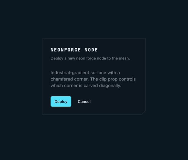
Chamfered Glass Card