
About
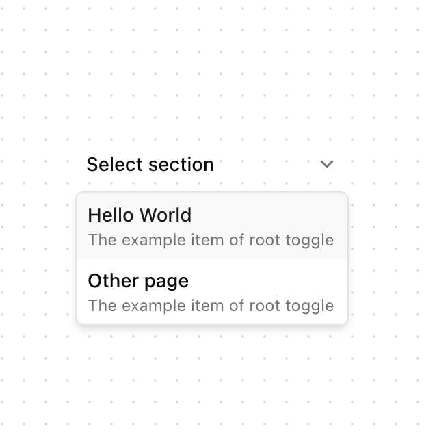
A select component for switching between major sections of your application, with support for descriptions and icons. Features - Smooth animations - Support for icons and descriptions - Keyboard navigation - Custom trigger styles - Active state tracking - Glass morphism effect - Responsive design
Built with React and Tailwind. Copy the prompt and paste it into Claude Code, Cursor or Lovable: your agent adds Root Toggle to your project and fits it to your theme.
Code
How Root Toggle is used: the demo's code. The component's own source comes with a free account.
Usage.tsx
import { RootSelect } from "@/components/ui/root-toggle"

function RootSelectDemo() {
  return (
    <div className="flex min-h-32 w-full items-start justify-center bg-transparent p-4">
      <RootSelect
        options={[
          {
            url: "#",
            title: "Hello World",
            description: "The example item of root toggle"
          },
          {
            url: "#",
            title: "Other page",
            description: "The example item of root toggle"
          }
        ]}
        placeholder="Select section"
        className="min-w-[200px]"
      />
    </div>
  )
}

export { RootSelectDemo }
Dependencies
More by Fuma Nama
View all
Banner
289
Zoomable Image
173
Accordion
30
Type Table
29
Tabs
7
Inline Table of Content
7
More in Navigation
View all

Liquid Glass Expandable Sidebar
76

Footer with Big Wordmark
40

Sidebar
392

Oversized 404 Numeral
78
Navbar with Theme Toggle
67

NavBar
2

Pagination
109
Tabs like bookmark
82
