

About
A decorative honeycomb-style wall of integration/partner logos arranged around a bright centre tile holding your product mark, used to illustrate "works with your stack" sections on landing pages.
Built with React and Tailwind. Copy the prompt and paste it into Claude Code, Cursor or Lovable: your agent adds Integration Grid to your project and fits it to your theme.
Code
How Integration Grid is used: the demo's code. The component's own source comes with a free account.
Usage.tsx
import { IntegrationGrid } from "@/components/ui/integration-grid";

export default function IntegrationGridDemo() {
  return (
    <section className="mx-auto w-full max-w-xl space-y-6 p-6">
      <IntegrationGrid />
      <div className="text-center">
        <h3 className="text-lg font-semibold text-foreground">
          Plays well with your stack
        </h3>
        <p className="text-sm text-muted-foreground">
          Connect the tools your team already relies on.
        </p>
      </div>
    </section>
  );
}
More by flohoeller
View all
Profile Menu
64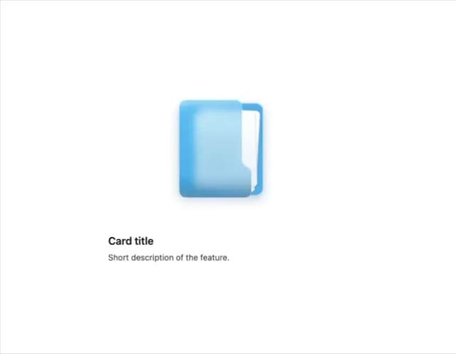
Side Folder
52
Tab Overload
46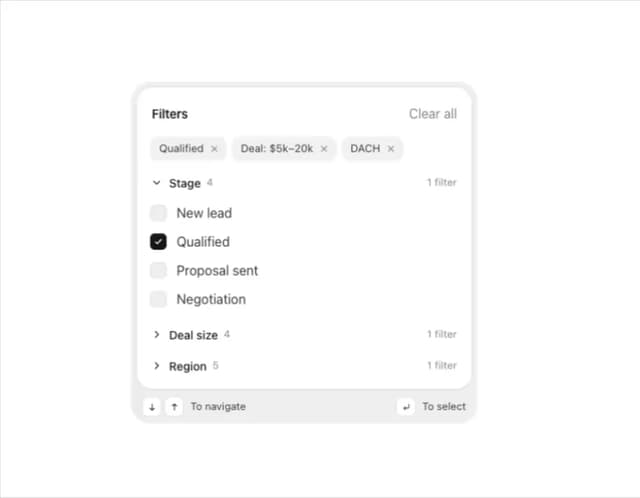
Filter Menu
38
Agent Team
33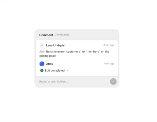
Comment Thread
28
Team Invite
26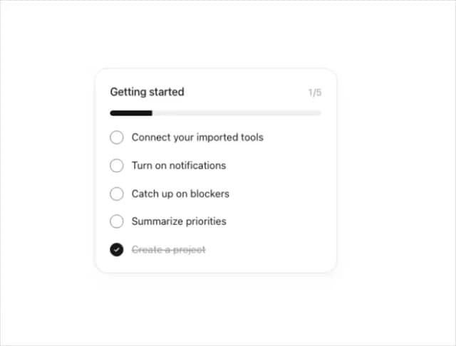
Progress Tracker
23