About
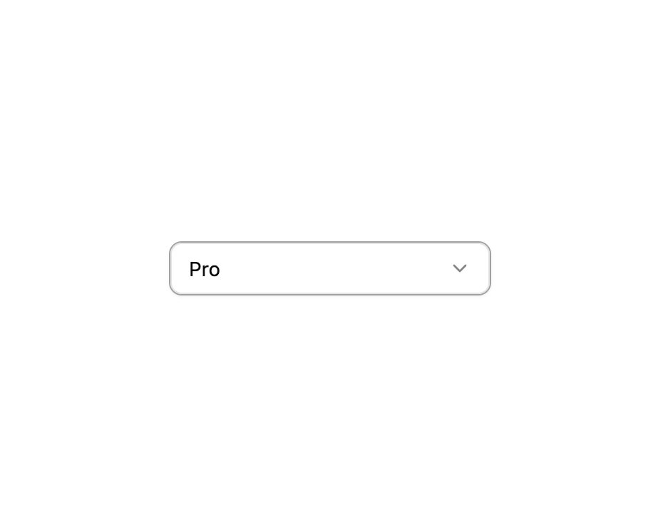
A select dropdown where individual options can be marked as disabled so users cannot choose them.
Built with React and Tailwind. Copy the prompt and paste it into Claude Code, Cursor or Lovable: your agent adds Select with Disabled Items to your project and fits it to your theme.
Code
How Select with Disabled Items is used: the demo's code. The component's own source comes with a free account.
Usage.tsx
import { Select07 } from "@/components/ui/select-07";

export default function Default() {
  return (
    <div className="flex min-h-52 w-full items-center justify-center p-6">
      <Select07 />
    </div>
  );
}
More by felipemenezes098
View all
Centered Hero with Image Fan
1.1K
Editorial Collage Hero
507
Split Hero With Image Cards
456
Editorial Image Hero
416
Scroll 01
401
Real Estate Search Hero
221
Editorial Hero
200
Hero with Dashboard Mockup
146
More in Forms
View all

Login 1
64

Premium Auth
571

Contact Card
1.1K

Form
18

Book A Demo 1
91
Authentication Card
52

Card Studio
47

Login Card
35
