
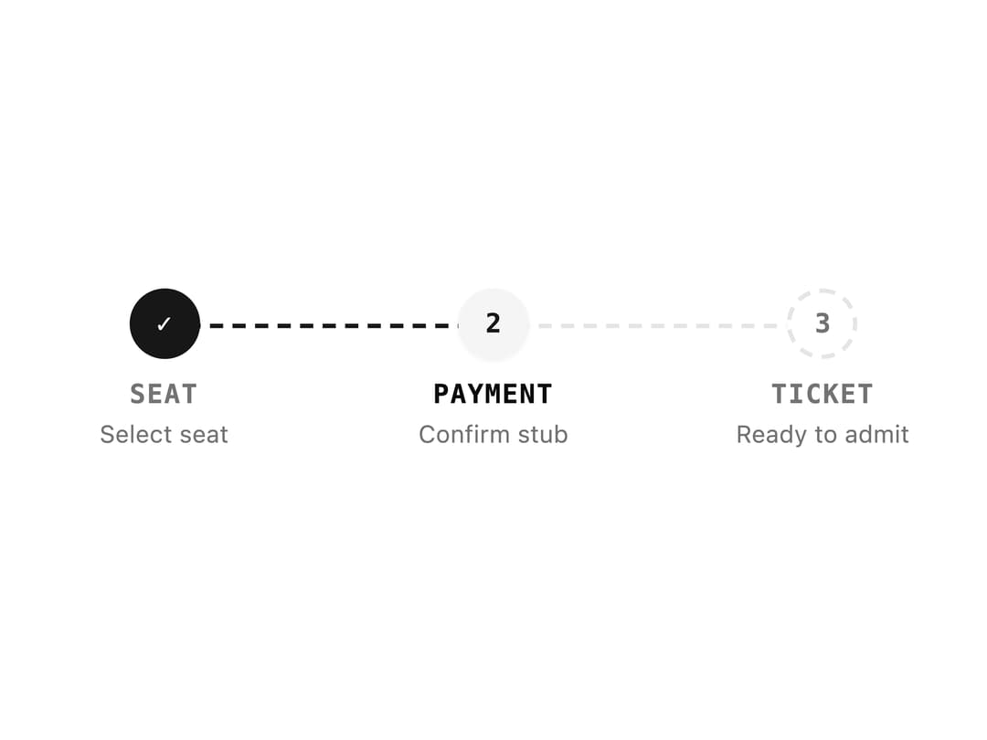
About
A horizontal numbered step indicator that shows progress through a multi-step flow such as a checkout or form wizard, with completed, current and pending states.
Built with React and Tailwind. Copy the prompt and paste it into Claude Code, Cursor or Lovable: your agent adds Progress Steps to your project and fits it to your theme.
Code
How Progress Steps is used: the demo's code. The component's own source comes with a free account.
Usage.tsx
import Steps from "@/components/ui/steps";

export default function StepsDemo() {
  return (
    <div className="w-full max-w-md">
      <Steps
        current={1}
        steps={[
          { title: "Seat", description: "Select seat" },
          { title: "Payment", description: "Confirm stub" },
          { title: "Ticket", description: "Ready to admit" },
        ]}
      />
    </div>
  );
}
More by f0rextasy
View all
Newsletter Signup Card
19
Board Checklist
15
Stamp Seal
15
Network Graph
14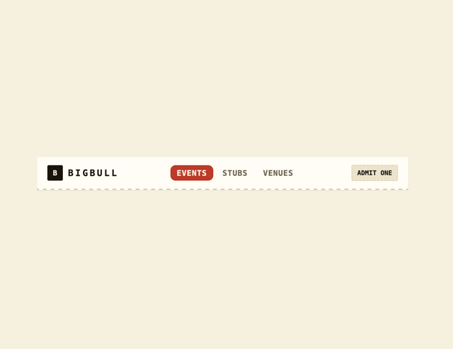
Navbar
12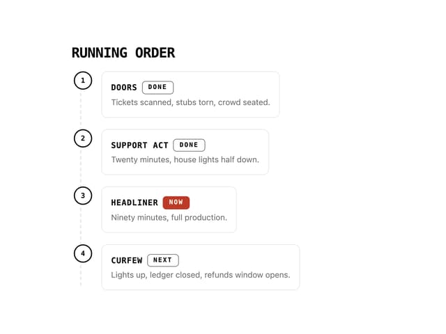
Running Order Timeline
11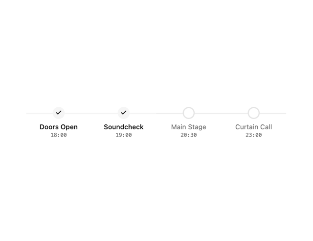
Milestone Chart
10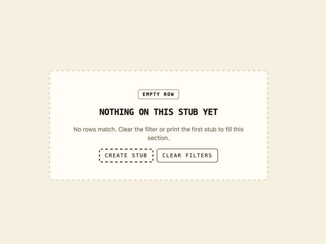
Empty State Card
7
More in Navigation
View all

Liquid Glass Expandable Sidebar
76

Footer with Big Wordmark
40

Sidebar
392

Oversized 404 Numeral
78
Navbar with Theme Toggle
67

NavBar
2

Pagination
109
Tabs like bookmark
82
