
About
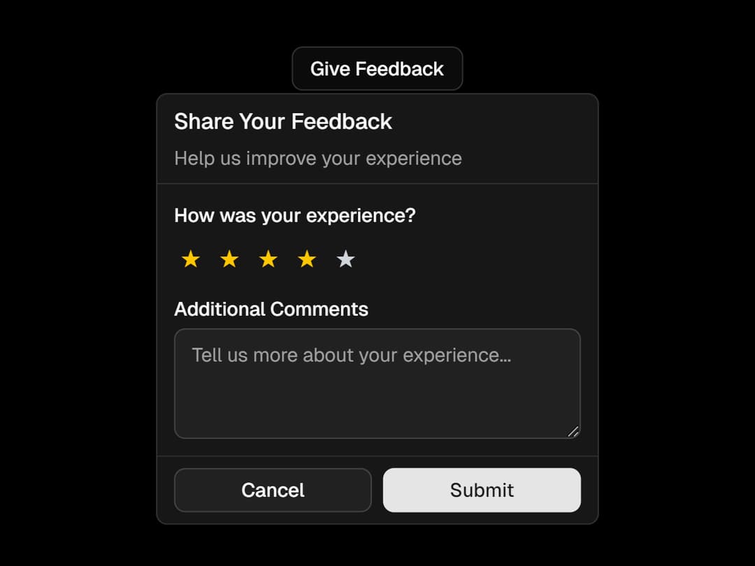
A beautifully wrapped Radix Popover with custom slots, animations, and sections like header, body, and footer — all styled for seamless integration. Easily build interactive popups with consistent UI and flexible layout support.
Built with React and Tailwind. Copy the prompt and paste it into Claude Code, Cursor or Lovable: your agent adds Popover to your project and fits it to your theme.
Code
How Popover is used: the demo's code. The component's own source comes with a free account.
Usage.tsx
'use client';
import React from 'react';
import {
	Popover,
	PopoverBody,
	PopoverContent,
	PopoverDescription,
	PopoverHeader,
	PopoverTitle,
	PopoverTrigger,
    PopoverClose,
	PopoverFooter,
} from '@/components/ui/popover';
import { Button } from '@/components/ui/button';
import { Label } from '@/components/ui/label';
import { Textarea } from '@/components/ui/textarea';


export default function FeedbackDemo() {
	const [rating, setRating] = React.useState(0);
	const [feedback, setFeedback] = React.useState('');

	return (
		<Popover>
			<PopoverTrigger asChild>
				<Button variant="outline" size="sm">
					Give Feedback
				</Button>
			</PopoverTrigger>
			<PopoverContent className="w-80">
				<PopoverHeader>
					<PopoverTitle>Share Your Feedback</PopoverTitle>
					<PopoverDescription>
						Help us improve your experience
					</PopoverDescription>
				</PopoverHeader>
				<PopoverBody className="space-y-4">
					<div>
						<Label className="text-sm">How was your experience?</Label>
						<div className="mt-2 flex space-x-1">
							{[1, 2, 3, 4, 5].map((star) => (
								<button
									key={star}
									onClick={() => setRating(star)}
									className={`h-6 w-6 hover:bg-accent rounded-full text-lg ${star <= rating ? 'text-yellow-400' : 'text-gray-300'}`}
								>
									★
								</button>
							))}
						</div>
					</div>
					<div>
						<Label htmlFor="feedback-text" className="text-sm">
							Additional Comments
						</Label>
						<Textarea
							id="feedback-text"
							placeholder="Tell us more about your experience..."
							value={feedback}
							onChange={(e) => setFeedback(e.target.value)}
							className="mt-1 min-h-[80px] text-sm"
						/>
					</div>
				</PopoverBody>
				<PopoverFooter className="grid-cols-2">
					<PopoverClose asChild>
						<Button variant="outline" size="sm">
							Cancel
						</Button>
					</PopoverClose>
					<Button size="sm">Submit</Button>
				</PopoverFooter>
			</PopoverContent>
		</Popover>
	);
}
Dependencies
More by Efferd
View all

Testimonials Columns
7.1K
Zoom Parallax
5.4K
Dotted Surface
3.6K
Footer Section
2.7K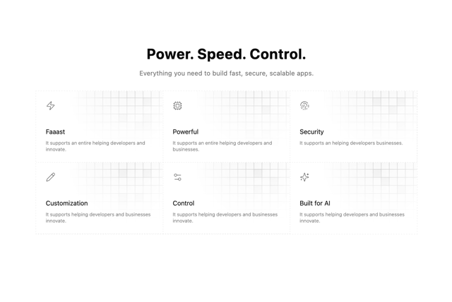
Grid Feature Cards
1.9K
Logo Cloud 2
1.8K
Header 3
1.6K
Logo Cloud 3
1.5K
More in Buttons
View all
Texture Button
108
Button
14

Notification Button
117

HeroUI Button Group
2

Eclipse Button
44
Button Save
50
App Store Button
484

Base Button
1


