About
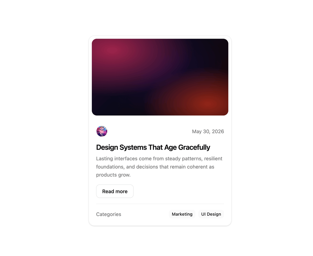
This is card component
Built with React and Tailwind. Copy the prompt and paste it into Claude Code, Cursor or Lovable: your agent adds New Card to your project and fits it to your theme.
Code
How New Card is used: the demo's code. The component's own source comes with a free account.
Usage.tsx
"use client";

import { GlassBlogCard } from "@/components/ui/glass-blog-card-shadcnui";

export function CardPreview() {
  return (
    <div className="flex min-h-screen items-center justify-center p-4">
      <GlassBlogCard />
    </div>
  );
}

export default CardPreview;
Dependencies
More by Edwin Vakayil
View all
Origin Button
869
Infinite Ribbon
586
Shimmer Text
443
Dia Text
373
Icon Bar
263
FAQ Pro
246
Verified Badge
233
Status Dot
122
More in Cards
View all

Course Design Cards
1.3K

Statistics Card 7
327
Statistics Card 2
305

Interactive Tech Stack Bento Grid with Hover Effects
625

Card Studio
5
The Item one
4

Weather Card
65

Card
9