
About
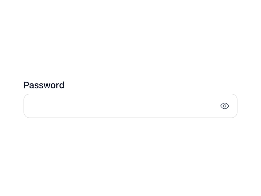
A small square icon button meant to sit inside a text field's own box, for actions like showing/hiding a password, clearing a search field, or copying a value.
Built with React and Tailwind. Copy the prompt and paste it into Claude Code, Cursor or Lovable: your agent adds Input Button to your project and fits it to your theme.
Code
How Input Button is used: the demo's code. The component's own source comes with a free account.
Usage.tsx
"use client";

import * as React from "react";
import InputButton from "@/components/ui/input-button";
import { ViewIcon, ViewOffSlashIcon } from "@hugeicons/core-free-icons";

export default function InputButtonDemo() {
  const [shown, setShown] = React.useState(false);
  const [value, setValue] = React.useState("");
  const id = React.useId();

  return (
    <div className="flex min-h-[260px] w-full items-center justify-center p-8">
      <div className="ib-demo-field">
        <label htmlFor={id}>Password</label>
        <div className="ib-demo-control">
          <input
            id={id}
            type={shown ? "text" : "password"}
            value={value}
            onChange={(e) => setValue(e.target.value)}
            autoComplete="current-password"
            autoCapitalize="off"
            spellCheck={false}
            required
          />
          <span className="ib-demo-addon">
            <InputButton
              icon={shown ? ViewOffSlashIcon : ViewIcon}
              aria-label="Show password"
              aria-pressed={shown}
              onClick={() => setShown((s) => !s)}
            />
          </span>
        </div>
      </div>
    </div>
  );
}
Dependencies
More by ebnsina
View all
Countdown Timer
33
Video Player
24
Alarm Clock
22
Voice Note
18
Hourglass Timer
16
Sortable List
16
Split Button
13
Sign In Auth Card
11
More in Buttons
View all
Texture Button
108
Button
14

Notification Button
117

HeroUI Button Group
2

Eclipse Button
44
Button Save
50

App Store Button
484

Base Button
1


