
About
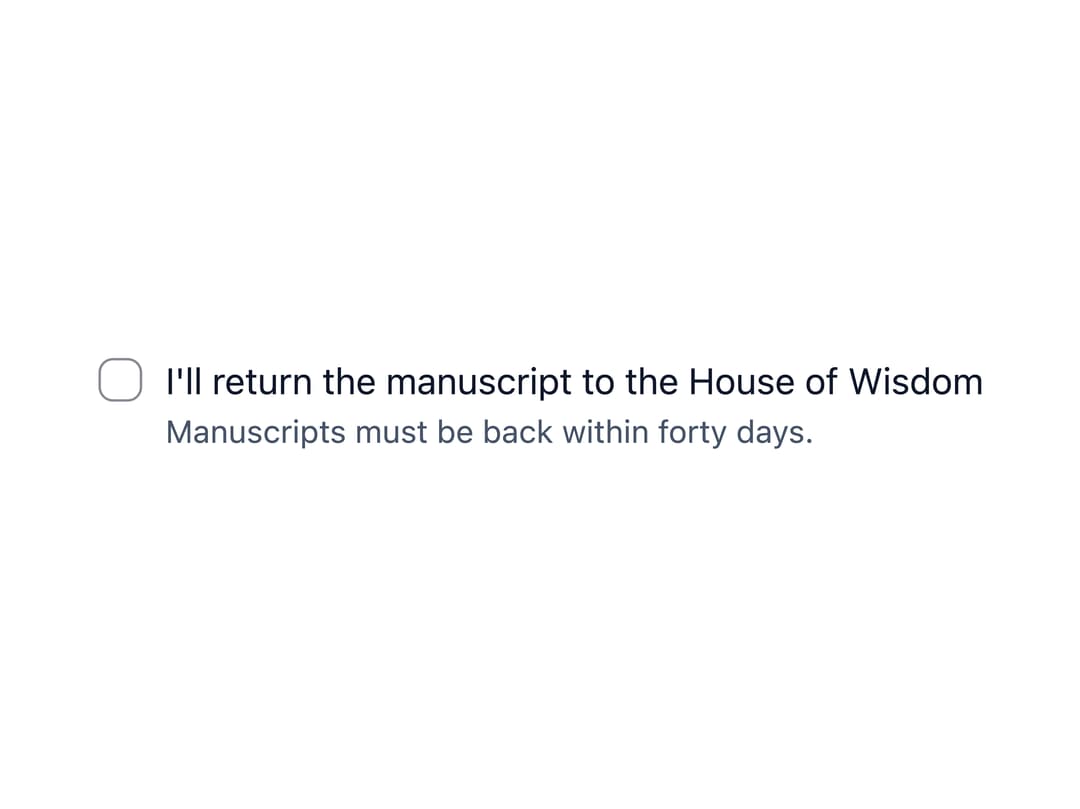
An accessible checkbox input with a label, optional hint/error text, and an indeterminate "select all" state for parent/child selections in forms.
Built with React and Tailwind. Copy the prompt and paste it into Claude Code, Cursor or Lovable: your agent adds Checkbox to your project and fits it to your theme.
Code
How Checkbox is used: the demo's code. The component's own source comes with a free account.
Usage.tsx
"use client";

import * as React from "react";
import Checkbox from "@/components/ui/checkbox";

export default function CheckboxDemo() {
  const [agreed, setAgreed] = React.useState(false);

  return (
    <Checkbox
      checked={agreed}
      onChange={(e) => setAgreed(e.target.checked)}
      hint="Manuscripts must be back within forty days."
    >
      I'll return the manuscript to the House of Wisdom
    </Checkbox>
  );
}
Dependencies
More by ebnsina
View all
Countdown Timer
33
Video Player
24
Alarm Clock
22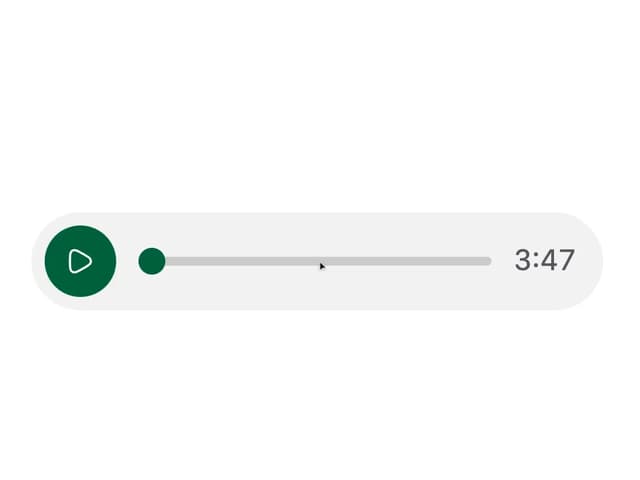
Voice Note
18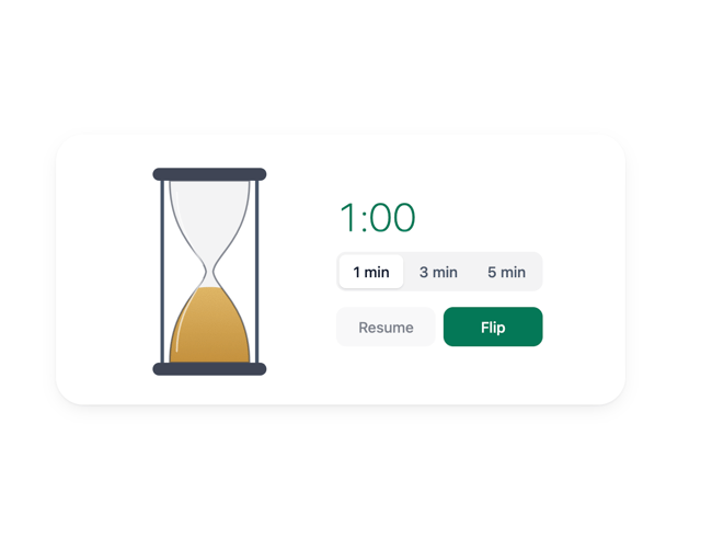
Hourglass Timer
16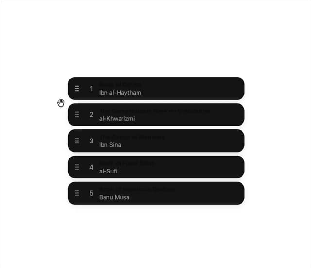
Sortable List
16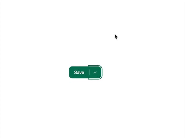
Split Button
13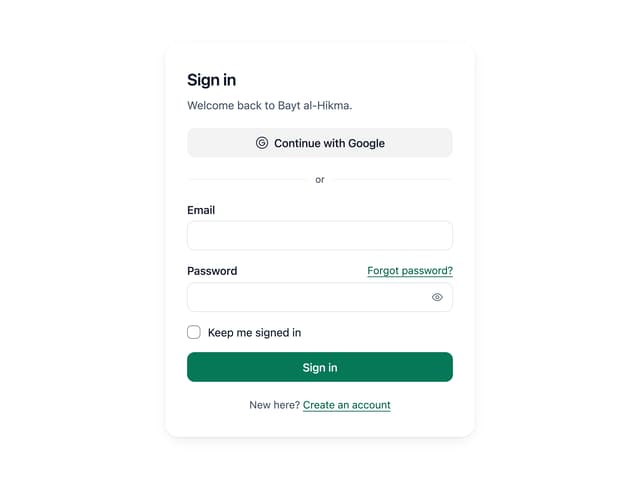
Sign In Auth Card
11
More in Forms
View all

Login 1
64

Premium Auth
571

Contact Card
1.1K

Form
18

Book A Demo 1
91
Authentication Card
52

Card Studio
47

Login Card
35
