About
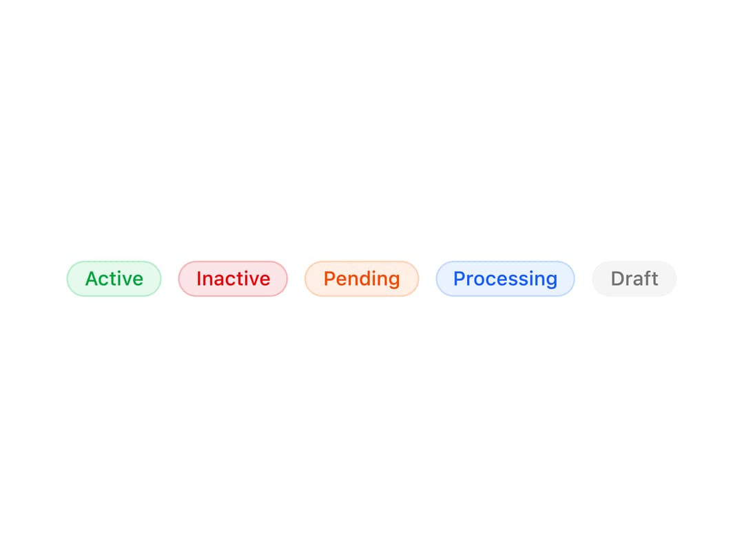
A pill-shaped status badge with a pulsing indicator dot and color variants for signaling online, error, warning, info, and idle states.
Built with React and Tailwind. Copy the prompt and paste it into Claude Code, Cursor or Lovable: your agent adds Status to your project and fits it to your theme.
Code
How Status is used: the demo's code. The component's own source comes with a free account.
Usage.tsx
import { Status, StatusLabel } from "@/components/ui/status";

export default function StatusTextOnlyDemo() {
  return (
    <div className="flex flex-wrap items-center gap-2.5">
      <Status variant="success">
        <StatusLabel>Active</StatusLabel>
      </Status>

      <Status variant="error">
        <StatusLabel>Inactive</StatusLabel>
      </Status>

      <Status variant="warning">
        <StatusLabel>Pending</StatusLabel>
      </Status>

      <Status variant="info">
        <StatusLabel>Processing</StatusLabel>
      </Status>

      <Status variant="default">
        <StatusLabel>Draft</StatusLabel>
      </Status>
    </div>
  );
}
Dependencies
More by Dice UI
View all

Compare Slider
87
Sortable
54
Circular Progress
44
Pending
31
Banner
23
Stack
15
Kanban Board
13
Marquee
12
More in Text
View all
Motion Blur Text
45

Rainbow Text Effect
58

Text Reveal
29
Blur Reveal
73

Short Slide Down
45
Apple Hello Effect
659

Scroll Fill Headline
14

Blur Reveal
364

