
About
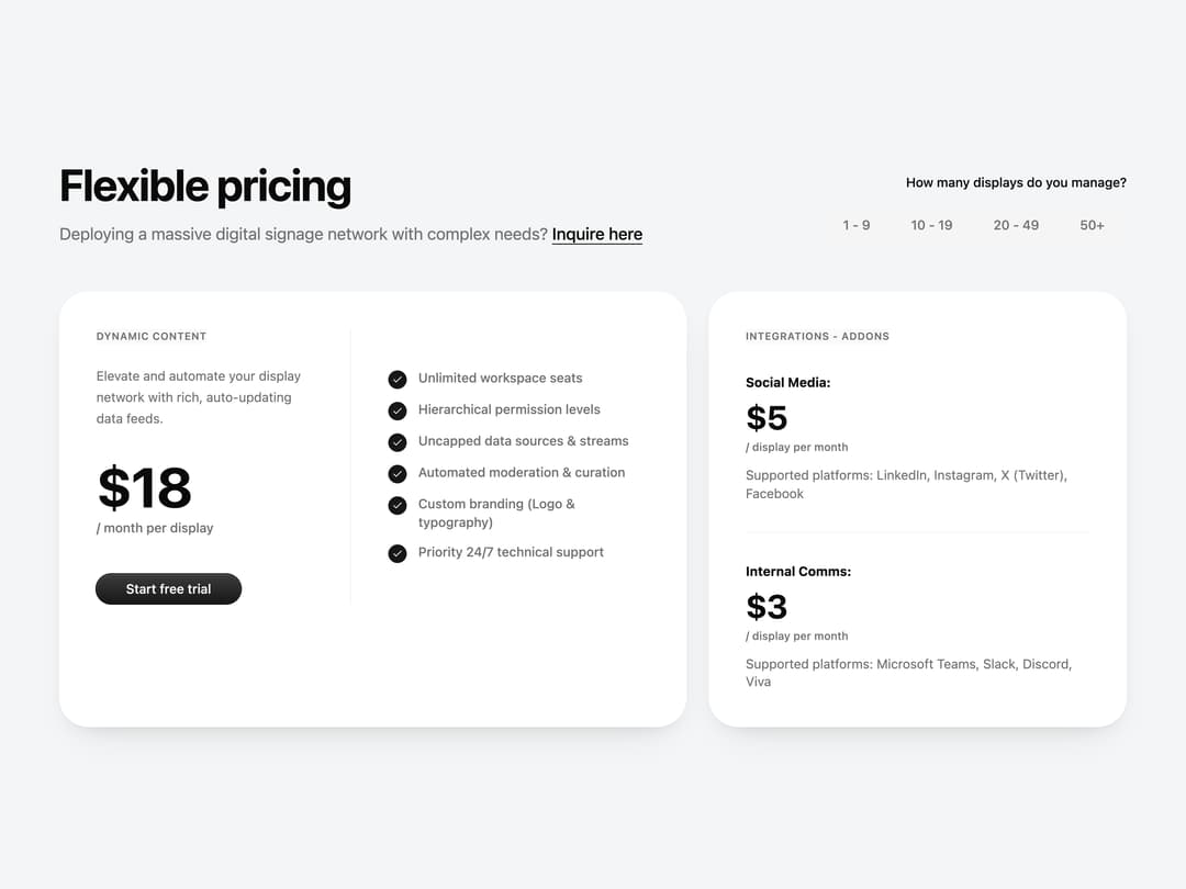
A two-column pricing section with a display-count toggle group that animates the price digits and lists core features plus add-on pricing.
Built with React and Tailwind. Copy the prompt and paste it into Claude Code, Cursor or Lovable: your agent adds Pricing With Usage Slider to your project and fits it to your theme.
Code
How Pricing With Usage Slider is used: the demo's code. The component's own source comes with a free account.
Usage.tsx
import Pricing from "@/components/ui/pricing-13";

export default function PricingDemo() {
  return (
    <div className="w-full px-4 py-10">
      <Pricing />
    </div>
  );
}
Dependencies
More by Diar Muradi
View all

Toggleable Add-on Pricing
206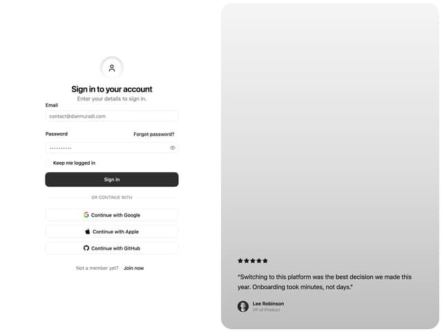
Split Sign In Form
122
Toggle Pricing Cards
93
ROI Pricing Calculator
63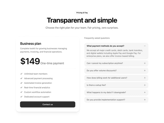
Pricing With FAQ
55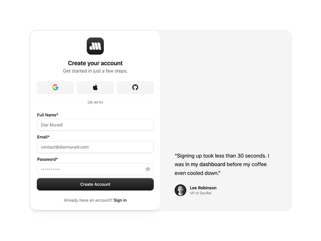
Sign Up Split Panel
54
Logo Orbit
50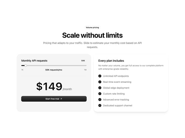
Volume Pricing Card
41
More in Pricing
View all
Pricing Section
691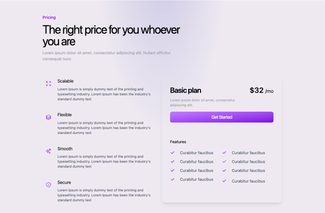
Colorful-Pricing
93

Pricing Section
201

Pricing Card
391
pricing section
175

RuixenPricing05
117
Single Pricing Card
818

Pricing Cards
33


