
About
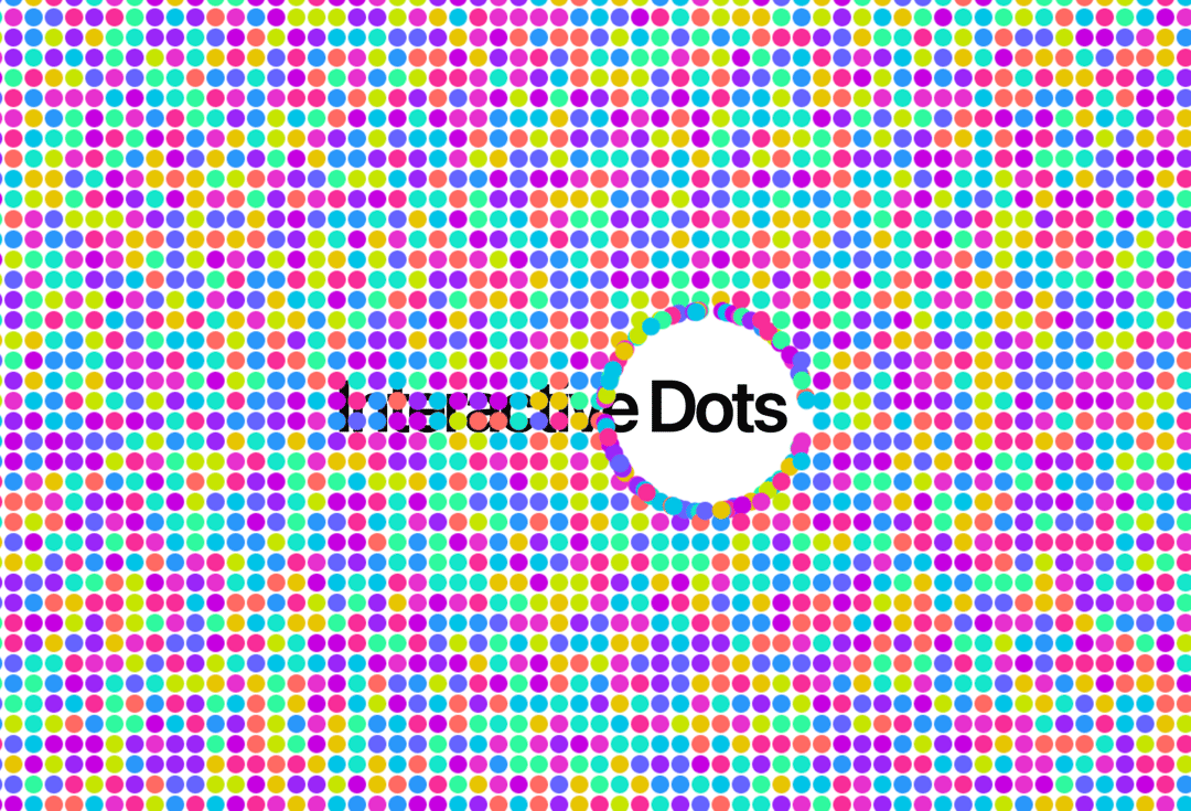
You can customize colors, spacing, dot size, repel force, and other parameters through props, and it includes proper cleanup and responsive behavior.
Built with React and Tailwind. Copy the prompt and paste it into Claude Code, Cursor or Lovable: your agent adds Interactive Dots to your project and fits it to your theme.
Code
How Interactive Dots is used: the demo's code. The component's own source comes with a free account.
Usage.tsx
import { InteractiveDots } from "@/components/ui/interactive-dots";

export default function DemoOne() {
  return (
    <div className="relative flex h-full w-full flex-col items-center justify-center overflow-hidden  ">
      <InteractiveDots spacing={20} dotRadius={9}/>
      <span className="pointer-events-none -z-10 text-center text-7xl leading-none font-semibold tracking-tighter whitespace-pre-wrap">
        Interactive Dots
      </span>
    </div>
  )
}More by Ali Imam
View all

Liquid Glass Button
7.1K
Shader Animation
3.9K
WebGL Shader
2.7K
Shader Lines
2.4K
Shiny Button
2.4K
GLSL Hills
2.2K
Canvas
1.8K
Gallery
1.6K
More in Backgrounds
View all

Background Components
28
Elegant Dark Pattern
922

Light theme Tailwind CSS Background Snippet
251
Tailwind CSS Background Snippet
615
Gradient Backgrounds
29
Background snippets
19
Jade Sky
110
Gradient Blur Bg
56

