

About
A compact labeled chip for showing a value, category, status, or interactive tag, with optional avatar/icon, a delete action, semantic color variants, and small/medium/large sizes. React port of the Chip component from Darshan Rajadhyaksha's SolidJS RockSolid component library.
Built with React and Tailwind. Copy the prompt and paste it into Claude Code, Cursor or Lovable: your agent adds Chip to your project and fits it to your theme.
Code
How Chip is used: the demo's code. The component's own source comes with a free account.
Usage.tsx
import type { MouseEvent } from "react";
import Chip from "@/components/ui/chip";

export default function Example() {
  const handleClick = (event: MouseEvent) => {
    console.log("Chip clicked", event);
  };
  return <Chip label="Click me" onClick={handleClick} />;
}
Dependencies
More by darshan-rajadhyaksha
View all
Switch
3
Backdrop
2
Accessible Dialog
1
Input
1
Avatar
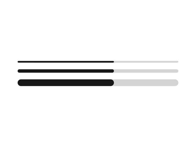
Progress Bar
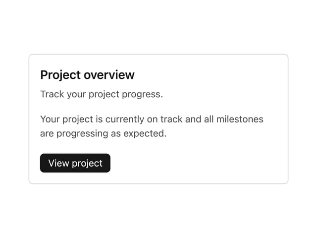
Card Content
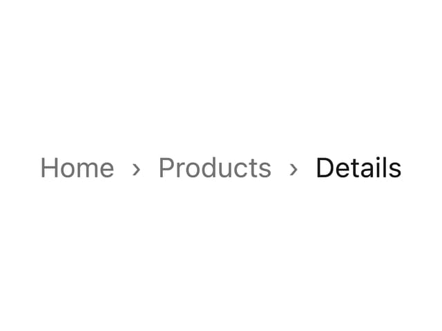
Breadcrumbs
More in Buttons
View all
Texture Button
108
Button
14

Notification Button
117

HeroUI Button Group
2

Eclipse Button
44
Button Save
50

App Store Button
484

Base Button
1


