
About
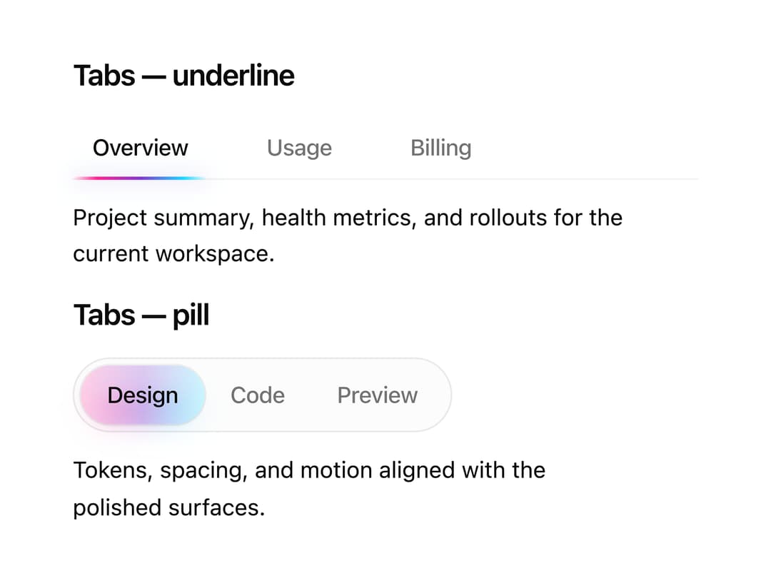
A tabs component with an animated gradient underline or pill indicator that slides between active tabs.
Built with React and Tailwind. Copy the prompt and paste it into Claude Code, Cursor or Lovable: your agent adds Halo Tabs to your project and fits it to your theme.
Code
How Halo Tabs is used: the demo's code. The component's own source comes with a free account.
Usage.tsx
"use client";

import {
  HaloTabs,
  HaloTabsContent,
  HaloTabsIndicator,
  HaloTabsList,
  HaloTabsTrigger,
} from "@/components/ui/halo-tabs";

export default function HaloTabsDemo() {
  return (
    <div>
      <section className="space-y-3">
        <h2 className="font-semibold text-foreground text-lg tracking-tight">
          Tabs — underline
        </h2>
        <HaloTabs className="w-full min-w-96 max-w-96" defaultValue="overview">
          <HaloTabsList variant="underline">
            <HaloTabsTrigger value="overview">Overview</HaloTabsTrigger>
            <HaloTabsTrigger value="usage">Usage</HaloTabsTrigger>
            <HaloTabsTrigger value="billing">Billing</HaloTabsTrigger>
            <HaloTabsIndicator variant="underline" />
          </HaloTabsList>
          <HaloTabsContent value="overview">
            Project summary, health metrics, and rollouts for the current
            workspace.
          </HaloTabsContent>
          <HaloTabsContent value="usage">
            API volume, seat counts, and rate limits for the billing period in
            view.
          </HaloTabsContent>
          <HaloTabsContent value="billing">
            Invoices, payment methods, and tax details for this account and
            billing.
          </HaloTabsContent>
        </HaloTabs>

        <h2 className="font-semibold text-foreground text-lg tracking-tight">
          Tabs — pill
        </h2>
        <HaloTabs className="w-full min-w-96 max-w-96" defaultValue="design">
          <HaloTabsList variant="pill">
            <HaloTabsTrigger value="design">Design</HaloTabsTrigger>
            <HaloTabsTrigger value="code">Code</HaloTabsTrigger>
            <HaloTabsTrigger value="preview">Preview</HaloTabsTrigger>
            <HaloTabsIndicator variant="pill" />
          </HaloTabsList>
          <HaloTabsContent value="design">
            Tokens, spacing, and motion aligned with the polished surfaces.
          </HaloTabsContent>
          <HaloTabsContent value="code">
            Implementation notes and props for each primitive.
          </HaloTabsContent>
          <HaloTabsContent value="preview">
            Live preview of the active variant.
          </HaloTabsContent>
        </HaloTabs>
      </section>
    </div>
  );
}
Dependencies
More by cult/ui
View all
3D Carousel
2.7K
Logo Carousel
1.1K
Feature Carousel
526
Popover Form
428
Floating Panel
255
Expandable
136
Dock
123
Hero Liquid Metal
121
More in Navigation
View all

Liquid Glass Expandable Sidebar
76

Footer with Big Wordmark
40

Sidebar
392

Oversized 404 Numeral
78
Navbar with Theme Toggle
67

NavBar
2

Pagination
109
Tabs like bookmark
82
