
About
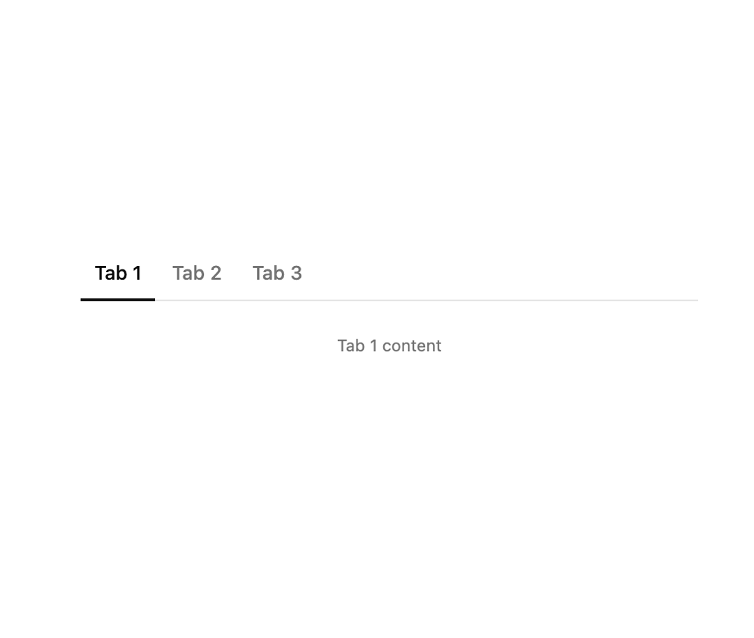
A tabs component with an animated underline indicator for switching between content panels.
Built with React and Tailwind. Copy the prompt and paste it into Claude Code, Cursor or Lovable: your agent adds Underline Tabs to your project and fits it to your theme.
Code
How Underline Tabs is used: the demo's code. The component's own source comes with a free account.
Usage.tsx
import Particle from "@/components/ui/v-tabs-2";

export default function Default() {
  return (
    <div className="w-full max-w-md">
      <Particle />
    </div>
  );
}
More by Cnippet
View all

Team
1.3K
Davincho Hero-1
709
Aero Hero-3
618
Random Letter Swap Navigation
560
Features
532
Services with Animated Hover Modal
486
Blogs
404
Aero Hero-1
378
More in Navigation
View all

Liquid Glass Expandable Sidebar
76

Footer with Big Wordmark
40

Sidebar
392

Oversized 404 Numeral
78
Navbar with Theme Toggle
67

NavBar
2

Pagination
109
Tabs like bookmark
82
