
About
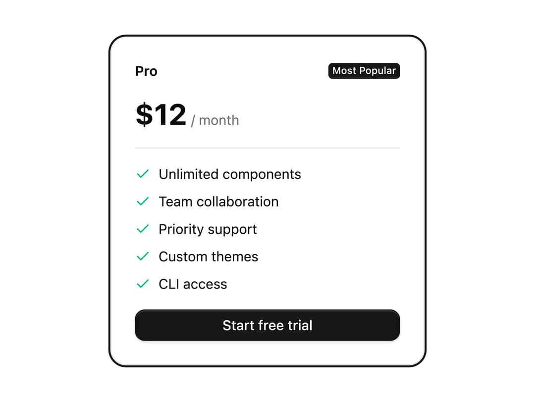
A pricing plan card with a feature checklist, a highlighted ring, a "Most Popular" badge, and a call-to-action button.
Built with React and Tailwind. Copy the prompt and paste it into Claude Code, Cursor or Lovable: your agent adds Pricing Plan Card to your project and fits it to your theme.
Code
How Pricing Plan Card is used: the demo's code. The component's own source comes with a free account.
Usage.tsx
import Pattern from "@/components/ui/v-card-18";

export default function Default() {
  return (
    <div className="flex min-h-svh w-full items-center justify-center p-6">
      <Pattern />
    </div>
  );
}
Dependencies
More by Cnippet
View all

Team
1.3K
Davincho Hero-1
709
Aero Hero-3
618
Random Letter Swap Navigation
560
Features
532
Services with Animated Hover Modal
486
Blogs
404
Aero Hero-1
378
More in Pricing
View all
Pricing Section
691
Colorful-Pricing
93

Pricing Section
201

Pricing Card
391
pricing section
175

RuixenPricing05
117
Single Pricing Card
818

Pricing Cards
33


