
About
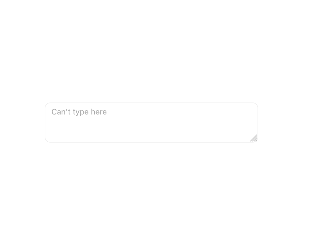
A multi-line text input field with auto-sizing, small/default/large sizes, disabled and invalid states built on Base UI.
Built with React and Tailwind. Copy the prompt and paste it into Claude Code, Cursor or Lovable: your agent adds Textarea to your project and fits it to your theme.
Code
How Textarea is used: the demo's code. The component's own source comes with a free account.
Usage.tsx
import { Textarea } from "@/components/ui/textarea";

export default function TextareaDisabledDemo() {
  return (
    <div className="w-full max-w-sm">
      <Textarea disabled placeholder="Can't type here" />
    </div>
  );
}
Dependencies
More by Cnippet
View all

Team
1.3K
Davincho Hero-1
709
Aero Hero-3
618
Random Letter Swap Navigation
560
Features
532
Services with Animated Hover Modal
486
Blogs
404
Aero Hero-1
378
More in Forms
View all

Login 1
63

Premium Auth
570

Contact Card
1.1K

Form
18

Book A Demo 1
91
Authentication Card
52

Card Studio
47

Login Card
35
