
About
A composable progress bar built on Base UI with track, indicator, label and value slots for showing task completion.
Built with React and Tailwind. Copy the prompt and paste it into Claude Code, Cursor or Lovable: your agent adds Progress to your project and fits it to your theme.
Code
How Progress is used: the demo's code. The component's own source comes with a free account.
Usage.tsx
"use client";

import { Progress } from "@/components/ui/progress";
import { useEffect, useState } from "react";

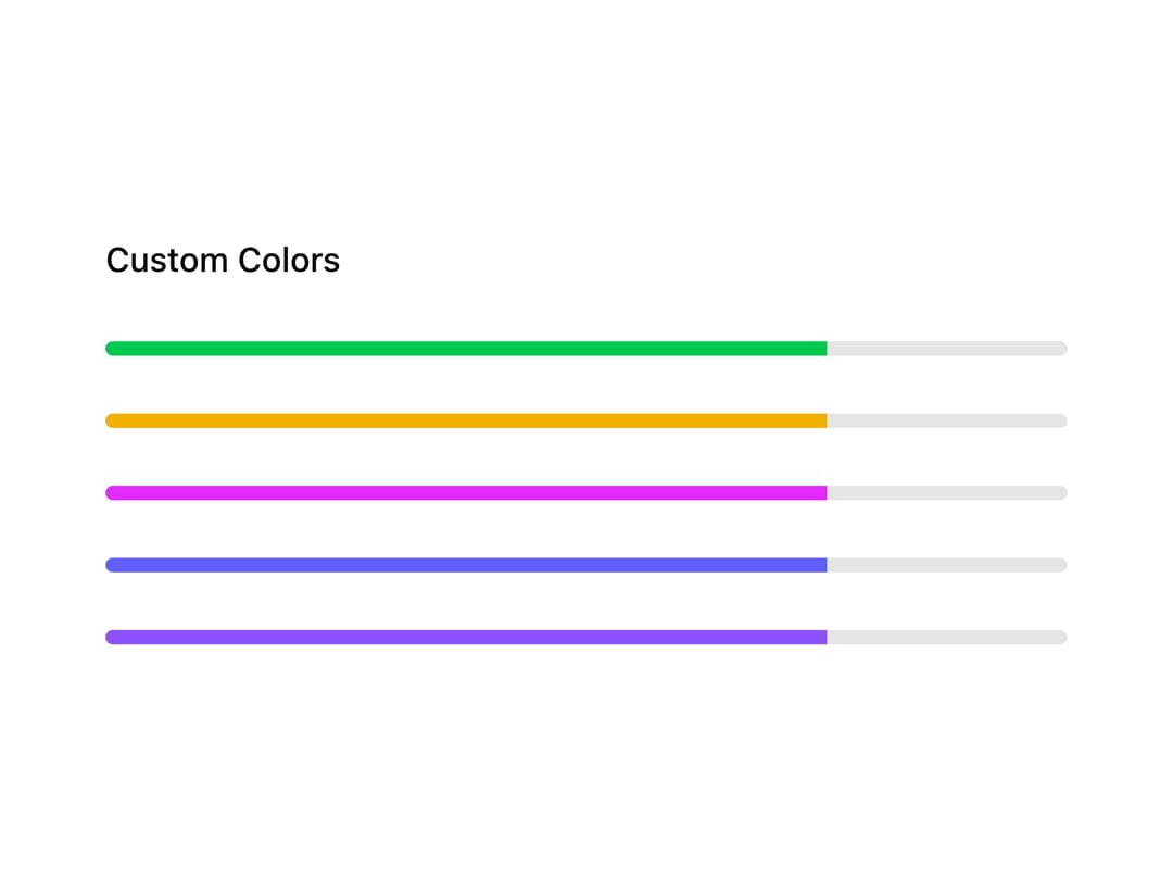
export default function ProgressCustomColors() {
  const [progress, setProgress] = useState(45);

  useEffect(() => {
    const timer = setTimeout(() => setProgress(75), 500);
    return () => clearTimeout(timer);
  }, []);

  return (
    <div className="mx-auto flex w-full max-w-md flex-col gap-6 p-6">
      <div className="flex items-center justify-between gap-2 text-sm font-medium text-foreground">
        Custom Colors
      </div>

      <Progress
        className="**:data-[slot=progress-indicator]:bg-green-500"
        value={progress}
      />
      <Progress
        className="**:data-[slot=progress-indicator]:bg-yellow-500"
        value={progress}
      />
      <Progress
        className="**:data-[slot=progress-indicator]:bg-fuchsia-500"
        value={progress}
      />
      <Progress
        className="**:data-[slot=progress-indicator]:bg-indigo-500"
        value={progress}
      />
      <Progress
        className="**:data-[slot=progress-indicator]:bg-violet-500"
        value={progress}
      />
    </div>
  );
}
Dependencies
More by Cnippet
View all

Team
1.3K
Davincho Hero-1
709
Aero Hero-3
618
Random Letter Swap Navigation
560
Features
532
Services with Animated Hover Modal
486
Blogs
404
Aero Hero-1
378