

About
Here is Switch component
Built with React and Tailwind. Copy the prompt and paste it into Claude Code, Cursor or Lovable: your agent adds Switch to your project and fits it to your theme.
Code
How Switch is used: the demo's code. The component's own source comes with a free account.
Usage.tsx
'use client'

import { useState } from 'react'

import { CheckIcon, XIcon } from 'lucide-react'

import { Switch } from '@/components/ui/switch'

const SwitchPermanentIndicatorDemo = () => {
  const [checked, setChecked] = useState<boolean>(true)

  return (
    <div>
      <div className='relative inline-grid h-7 grid-cols-[1fr_1fr] items-center text-sm font-medium'>
        <Switch
          checked={checked}
          onCheckedChange={setChecked}
          className='peer data-[state=unchecked]:bg-input/50 absolute inset-0 h-[inherit] w-14 [&_span]:z-10 [&_span]:size-6.5 [&_span]:transition-transform [&_span]:duration-300 [&_span]:ease-[cubic-bezier(0.16,1,0.3,1)] [&_span]:data-[state=checked]:translate-x-7 [&_span]:data-[state=checked]:rtl:-translate-x-7'
          aria-label='Switch with permanent icon indicators'
        />
        <span className='pointer-events-none relative ml-0.5 flex min-w-8 items-center justify-center text-center transition-transform duration-300 ease-[cubic-bezier(0.16,1,0.3,1)] peer-data-[state=checked]:invisible peer-data-[state=unchecked]:translate-x-6 peer-data-[state=unchecked]:rtl:-translate-x-6'>
          <XIcon className='size-4' aria-hidden='true' />
        </span>
        <span className='peer-data-[state=checked]:text-background pointer-events-none relative flex min-w-8 items-center justify-center text-center transition-transform duration-300 ease-[cubic-bezier(0.16,1,0.3,1)] peer-data-[state=checked]:-translate-x-full peer-data-[state=unchecked]:invisible peer-data-[state=checked]:rtl:translate-x-full'>
          <CheckIcon className='size-4' aria-hidden='true' />
        </span>
      </div>
    </div>
  )
}

export default SwitchPermanentIndicatorDemo
More by Clevision
View all

Syntra Hero
170
Calendar
111
Card Studio
108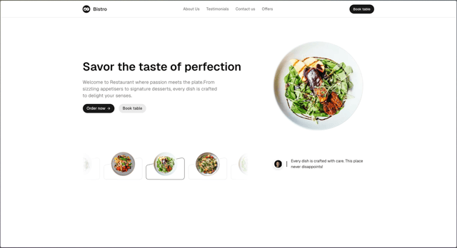
Hero Section 41
62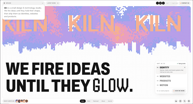
Agency Hero
52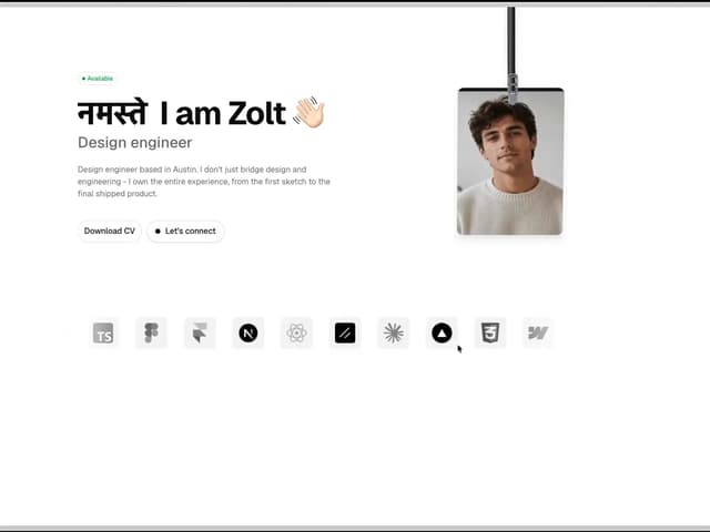
Hero Section
44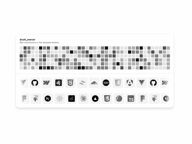
Logo Cloud
43
Hero Section 01
43
More in Forms
View all

Login 1
64

Premium Auth
571

Contact Card
1.1K

Form
18

Book A Demo 1
91
Authentication Card
52

Login Card
35
Login Card
6

