
About
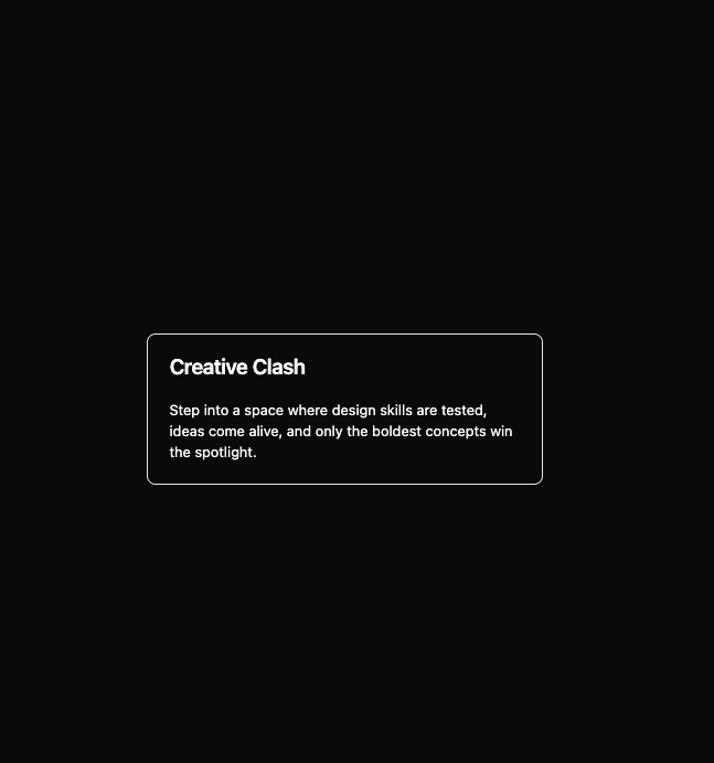
Here is Card component
Built with React and Tailwind. Copy the prompt and paste it into Claude Code, Cursor or Lovable: your agent adds Card Studio to your project and fits it to your theme.
Code
How Card Studio is used: the demo's code. The component's own source comes with a free account.
Usage.tsx
import { Card, CardContent, CardHeader, CardTitle } from '@/components/ui/card'

const CardOutlineDemo = () => {
  return (
    <Card className='border-primary max-w-md gap-0 bg-transparent shadow-none'>
      <CardHeader>
        <CardTitle>Creative Clash</CardTitle>
      </CardHeader>
      <CardContent>
        Step into a space where design skills are tested, ideas come alive, and only the boldest concepts win the
        spotlight.
      </CardContent>
    </Card>
  )
}

export default CardOutlineDemo
More by Clevision
View all

Syntra Hero
170
Calendar
111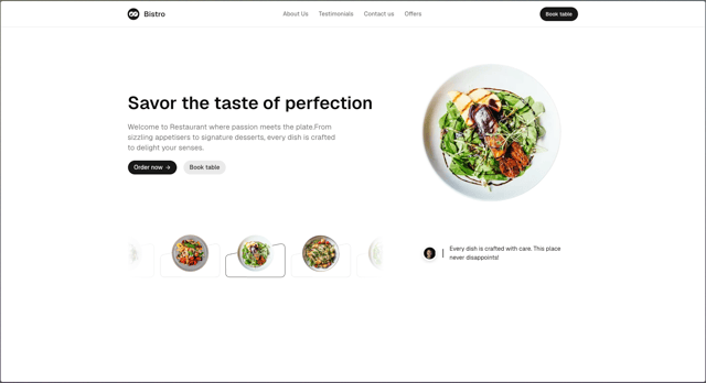
Hero Section 41
62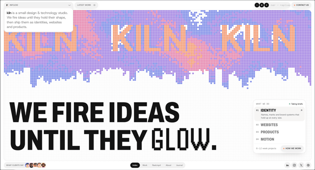
Agency Hero
52
Hero Section
44
Logo Cloud
43
Hero Section 01
43
Collapsible
43
More in Cards
View all

Course Design Cards
1.3K

Statistics Card 7
327
Statistics Card 2
305

Interactive Tech Stack Bento Grid with Hover Effects
625
The Item one
4

Weather Card
65

Card
9
Statistics Card 10
294