
About
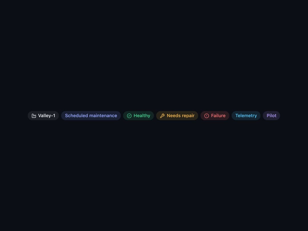
A small pill-shaped label used as a toggleable filter, a removable applied-filter tag, or a static tag, with optional icon and tone colors.
Built with React and Tailwind. Copy the prompt and paste it into Claude Code, Cursor or Lovable: your agent adds Chip to your project and fits it to your theme.
Code
How Chip is used: the demo's code. The component's own source comes with a free account.
Usage.tsx
"use client";

import Chip, { ChipGroup } from "@/components/ui/chip";
import { Factory, CircleCheck, Wrench, CircleAlert } from "lucide-react";

export default function ChipTonesDemo() {
  return (
    <div className="flex min-h-[160px] w-full items-center justify-center p-8">
      <ChipGroup>
        <Chip icon={<Factory size={13} />}>Valley-1</Chip>
        <Chip tone="accent">Scheduled maintenance</Chip>
        <Chip tone="success" icon={<CircleCheck size={13} />}>
          Healthy
        </Chip>
        <Chip tone="warning" icon={<Wrench size={13} />}>
          Needs repair
        </Chip>
        <Chip tone="danger" icon={<CircleAlert size={13} />}>
          Failure
        </Chip>
        <Chip tone="info">Telemetry</Chip>
        <Chip tone="violet">Pilot</Chip>
      </ChipGroup>
    </div>
  );
}
Dependencies
More by bypaws
View all
Popover