About
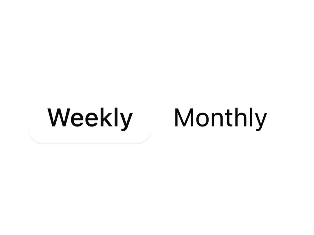
A pill-style single-select switcher (like Weekly/Monthly/Yearly toggles) with an animated sliding thumb behind the selected option.
Built with React and Tailwind. Copy the prompt and paste it into Claude Code, Cursor or Lovable: your agent adds Segmented Control to your project and fits it to your theme.
Code
How Segmented Control is used: the demo's code. The component's own source comes with a free account.
Usage.tsx
"use client";

import {
  SegmentedControl,
  SegmentedControlItem,
} from "@/components/ui/segmented-control";
import { useState } from "react";

export default function SegmentedControlControlledDemo() {
  const [period, setPeriod] = useState(new Set(["weekly"]));

  return (
    <div className="flex items-center justify-center p-10">
      <SegmentedControl
        selectedKeys={period}
        onSelectionChange={(keys) => {
          const nextKeys = keys as Set<string>;
          if (nextKeys.size > 0) setPeriod(new Set(nextKeys));
        }}
        aria-label="Period"
      >
        <SegmentedControlItem id="weekly">Weekly</SegmentedControlItem>
        <SegmentedControlItem id="monthly">Monthly</SegmentedControlItem>
      </SegmentedControl>
    </div>
  );
}
Dependencies
More by boardui
View all

Social Button
3
Notification Center
Spinner
Dropdown
Icon Button
Chip